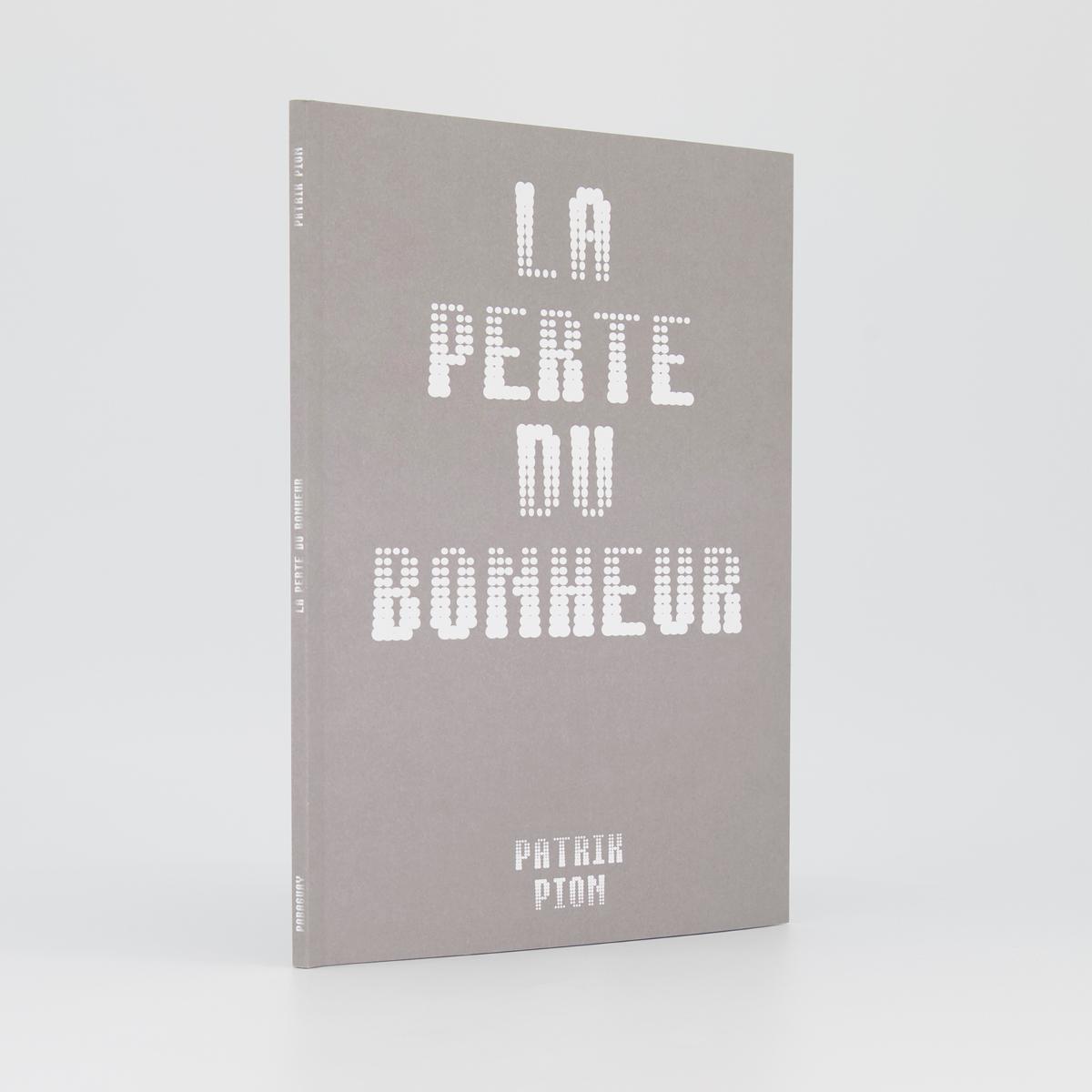
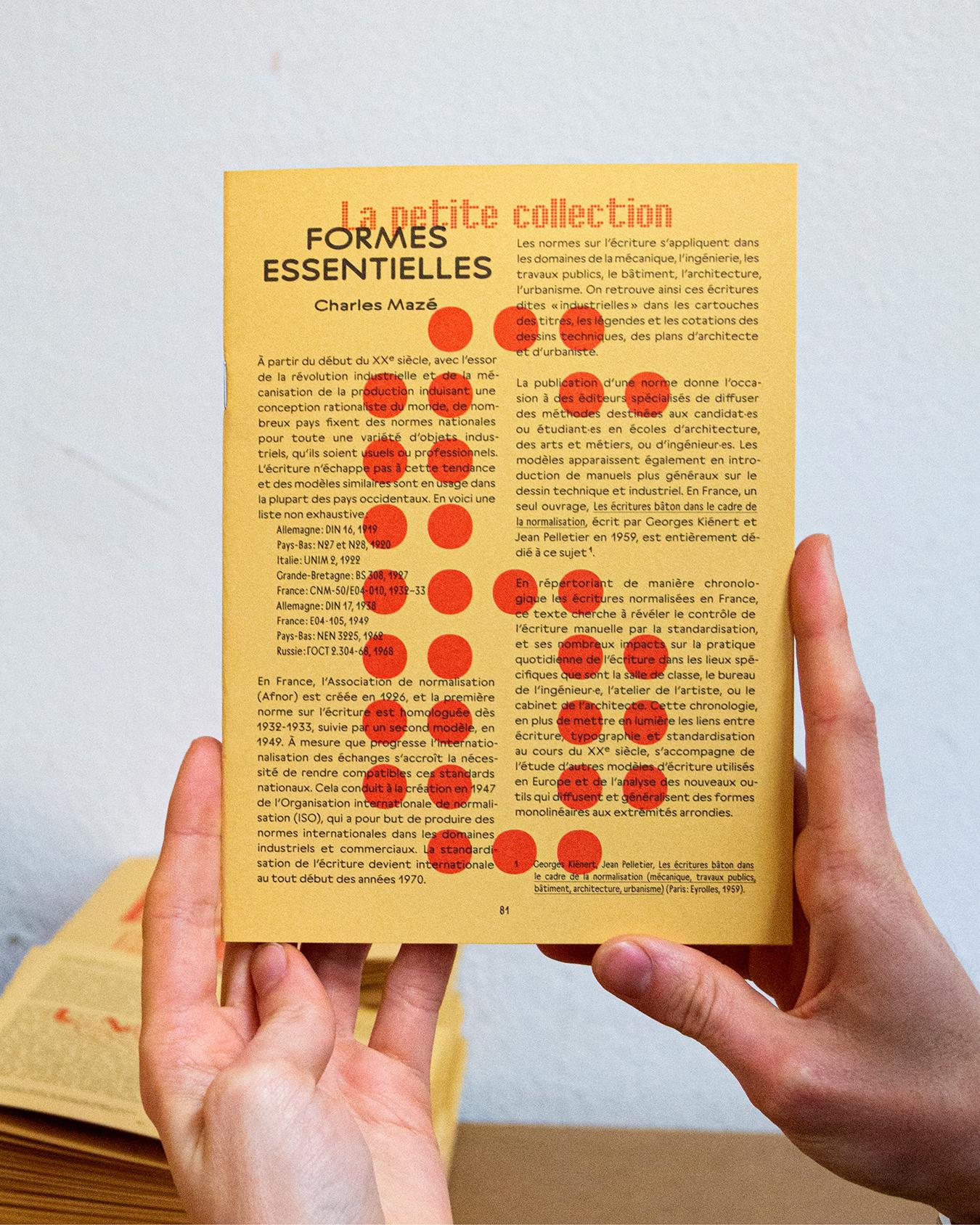
Designed by Roman Seban, the modular typeface Bertin is inspired by the work of the famous French cartographer Jacques Bertin and Dutch graphic designer Jurriaan Schrofer.
In 1967, Jacques Bertin (1918–2010) published Semiology of Graphics: Diagrams, Networks, Maps, a fundamental treatise in contemporary cartographic thinking. In this book, he established a series of parameters for representing information, defining six visual variables which he used to construct his graphical system.
In 1973, Jurriaan Schrofer (1926–1990) designed the cover of a reprint of Semiology of Graphics. He proposed a typographic application of Bertin’s graphical system. His typeface, constructed on a grid with a highly rigorous approach, typographically illustrates the six visual variables defined by the cartographer.
With Bertin, Roman Seban presents a synthetic and revitalized interpretation of both the cartographer’s and the graphic designer’s work. Thanks to variable font technology, the different styles of the typeface combine multiple axes of visual variables.
The Bertin typeface can be divided into two families—Bertin Dot and Bertin Square—built with an identical frame, but based on two different modules. Bertin Dot uses the circle whereas Bertin Square employs the square.
Bertin Dot and Square are respectively deployed in 6 styles, based on 6 transformations;
- Size: reduction or enlargement of the modules;
- Shape: a horizontal or vertical compression of the modules;
- Value: like a gradient, a gradual variation in the size of the modules, from bottom to top or from top to bottom;
- Multi: a combination of the Shape and Value styles • Rotation: rotation of the modules from 0 to 180°;
- Orientation: rotation of the modules towards a common vanishing point.
The axes of variable fonts enable a gradual transformation of the modules, allowing users to adjust the desired effect according to their preferences.
The originality of Bertin allows it to be adapted to different use contexts. It is clearly a display typeface: the boldest choices allow for the composition of spectacular titles, whereas more restrained settings ensure legible running text, even in smaller sizes.
Regardless of the variable setting applied, each glyph shares the same metrics. This lets the user overlay the same text composed in different styles and infinitely multiply the formal possibilities.
62 Styles
Square Size
Square Value
Square Orientation
Dot Size
Dot Value
Dot Orientation
Square Shape
Square Multi
Square Rotation
Dot Shape
Dot Multi
Dot Rotation
12 Variables
Square Size
Square Value
Square Orientation
Dot Size
Dot Value
Dot Orientation
Square Shape
Square Multi
Square Rotation
Dot Shape
Dot Multi
Dot Rotation
OpenType Features
Character Map
2
Supported Languages
▼
- Abenaki
- Afaan Oromo
- Afar
- Afrikaans
- Albanian
- Alsatian
- Amis
- Anuta
- Aragonese
- Aranese
- Aromanian
- Arrernte
- Arvanitic
- Asturian
- Atayal
- Aymara
- Azerbaijani
- Bashkir
- Basque
- Belarusian
- Bemba
- Bikol
- Bislama
- Bosnian
- Breton
- Bulgarian
- Romanization
- Cape Verdean
- Catalan
- Cebuano
- Chamorro
- Chavacano
- Chichewa
- Chickasaw
- Chinese Pinyin
- Cimbrian
- Cofan
- Cornish
- Corsican
- Creek
- Crimean Tatar
- Croatian
- Czech
- Danish
- Dawan
- Delaware
- Dholuo
- Drehu
- Dutch
- English
- Esperanto
- Estonian
- Faroese
- Fijian
- Filipino
- Finnish
- Folkspraak
- French
- Frisian
- Friulian
- Gagauz
- Galician
- Ganda
- Genoese
- German
- Gikuyu
- Gooniyandi
- Greenlandic
- Greenlandic Old
- Orthography
- Guadeloupean
- Gwichin
- Haitian Creole
- Han
- Hawaiian
- Hiligaynon
- Hopi
- Hotcak
- Hungarian
- Icelandic
- Ido
- Ilocano
- Indonesian
- Interglossa
- Interlingua
- Irish
- Istroromanian
- Italian
- Jamaican
- Javanese
- Jerriais
- Kaingang
- Kala Lagaw Ya
- Kapampangan
- Kaqchikel
- Karakalpak
- Karelian
- Kashubian
- Kikongo
- Kinyarwanda
- Kiribati
- Kirundi
- Klingon
- Kurdish
- Ladin
- Latin
- Latino Sine
- Latvian
- Lithuanian
- Lojban
- Lombard
- Low Saxon
- Luxembourgish
- Maasai
- Makhuwa
- Malay
- Maltese
- Manx
- Maori
- Marquesan
- Meglenoromanian
- Meriam Mir
- Mirandese
- Mohawk
- Moldovan
- Montagnais
- Montenegrin
- Murrinhpatha
- Nagamese Creole
- Nahuatl
- Ndebele
- Neapolitan
- Ngiyambaa
- Niuean
- Noongar
- Norwegian
- Novial
- Occidental
- Occitan
- Oshiwambo
- Ossetian
- Palauan
- Papiamento
- Piedmontese
- Polish
- Portuguese
- Potawatomi
- Qeqchi
- Quechua
- Rarotongan
- Romanian
- Romansh
- Rotokas
- Sami Inari
- Sami Lule
- Sami Northern
- Sami Southern
- Samoan
- Sango
- Saramaccan
- Sardinian
- Scottish Gaelic
- Serbian
- Seri
- Seychellois
- Shawnee
- Shona
- Sicilian
- Silesian
- Slovak
- Slovenian
- Slovio
- Somali
- Sorbian Lower
- Sorbian Upper
- Sotho Northern
- Sotho Southern
- Spanish
- Sranan
- Sundanese
- Swahili
- Swazi
- Swedish
- Tagalog
- Tahitian
- Tetum
- Tok Pisin
- Tokelauan
- Tongan
- Tshiluba
- Tsonga
- Tswana
- Tumbuka
- Turkish
- Turkmen
- Tuvaluan
- Tzotzil
- Ukrainian
- Uzbek
- Venetian
- Vepsian
- Volapuk
- Voro
- Wallisian
- Walloon
- Waraywaray
- Warlpiri
- Wayuu
- Welsh
- Wikmungkan
- Wiradjuri
- Wolof
- Xavante
- Xhosa
- Yapese
- Yindjibarndi
- Zapotec
- Zazaki
- Zulu Zuni


