205 Corp.
24, rue Commandant-Faurax
69006 Lyon
France
T. 33 (0)4 37 47 85 69
M. contact@205.tf
Newsletter
How did you get involved with typeface design? What led you to this practice?
I’ve always been curious about letterforms, but it was while studying at the CFPA Geneva that I began to work with type design and page layout for the first time, based on circles, squares, and triangles. It was later on at the HEAD–Geneva that I decided to make typography a central element in my work. I soon felt “hemmed in” as a graphic designer, quickly wanting to create my own typefaces so as to expand my field of practice. Later on I decided to fully dedicate myself to type design, joining the Master in Type Design at the ECAL where I obtained my degree in June 2021, with the presentation of Tifo.
What influences you? Are there typeface designers whose work you appreciate in particular?
My influences are quite diverse. I’m spontaneously attracted to typographic elements of everyday life and the emotion that emanates from them due to the simple fact of their authenticity and, occasionally, their awkwardness; this includes the vernacular typographies of store signs among others. I am also influenced by the 1970s, and more particularly by the work of Herb Lubalin. The power of his work and his ability to transform words into images continue to be a major source of inspiration. His struggle to obtain a decent salary for type designers is actually a very important cause in my eyes, and continues to be highly topical. I’m also interested in more experimental and contemporary approaches that mix different techniques. I am thinking in particular of the work of Karl Nawrot and his research on the typographic form.
In your opinion, what is the point of creating a new typeface when so many already exist?
In my opinion typography bears witness to an epoch, and allows one to respond to a set of specific requirements and expectations at a particular moment. The world changes, technologies evolve, and typography adapts itself to these changes. Each new typeface is the translation of an emotion, an idea, or even a context that will define its appearance. I consider that every project is unique, developing within a specific framework. To create a new typeface is to design the best tool for translating an idea in the most faithful manner, in accordance with the spirit of the times.
Is it really possible to create something new in the field of typeface design?
It all depends on what one means by new! I think so, and this is where the designer plays an essential role. By taking inspiration from ancient sources as well as existing forms, they reinterpret established rules to create new ones depending on different factors: technological, cultural, and even stylistic. Creation has no limits as the world is constantly evolving. There will always be older typefaces to reinterpret and new forms to explore.
How do you begin work on a new typeface? Do you have a particular process?
It depends on the nature of the project and its goals. Every starting point is different. Sometimes an intuition reveals itself to be accurate, sometimes more research is necessary. Generally I take care to avoid historical sources, preferring to let myself be guided by more abstract elements that are not directly connected to typography. This could be an emotion, a piece of music, or even a sculpture…
I try to proceed in an intuitive manner, based on what I have in mind and staying away from the computer for as long as possible. Once I’ve defined the spirit of the typeface, I engage with typographic sources. Then I develop a limited number of glyphs that I explore the potential of in order to define rules that will allow me to expand the set of typefaces.
What is your relationship with the history of typography? What is your relationship with technology?
Typography is inseparable from its context, from its epoch. It always refers to a period of history, translating the spirit of the time. Certain forms seem to be stylistic choices, whereas in reality often they are the result of technical constraints, and of a particular historical context. It seems to me to be primordial to be aware of this in order to better understand what “makes” a typeface and integrate these different parameters into one’s project.
The technology and software used in type design are tools like any other. They can allow one to create more rapidly if one truly masters them. Otherwise technology no longer serves design, but rather swallows it up.
Why have you chosen to distribute your characters and typefaces with 205TF?
205TF publishes very high quality typefaces, both in terms of design and technique. Furthermore, it is not uncommon to observe type families with atypical construction schemes featured in its catalogue. More than just a wonderful opportunity, 205TF publishing Tifo was the logical choice in view of its different particular styles that are all nevertheless grouped together in a single type family.
Do you think that typography can save the world?
I think that it might be a little pretentious to think that. But on a more modest level, working with more responsible and ethical companies is a good place to start!
Do you teach? If so, where, and why does this role of transmission seem important to you?
I’m currently working as an assistant in the Visual Communication bachelor’s degree in the HEAD–Geneva. The fact of working in a teaching environment nourishes me greatly thanks to exchanges with students, teachers and other participants. This daily contact helps me to sharpen my view, and to consider the place of the graphic designer in current society. It is a true source of inspiration, both on a personal, and professional level.
What type design project are you currently working on?
I’m currently developing a typeface that I began working on during my Master’s degree in the ECAL. A geometric, sans serif typeface with variations for each style. I am also working on a number of visual identity projects, and this allows me to link typography and graphic design, always for clients that I can identify with.
Fonts
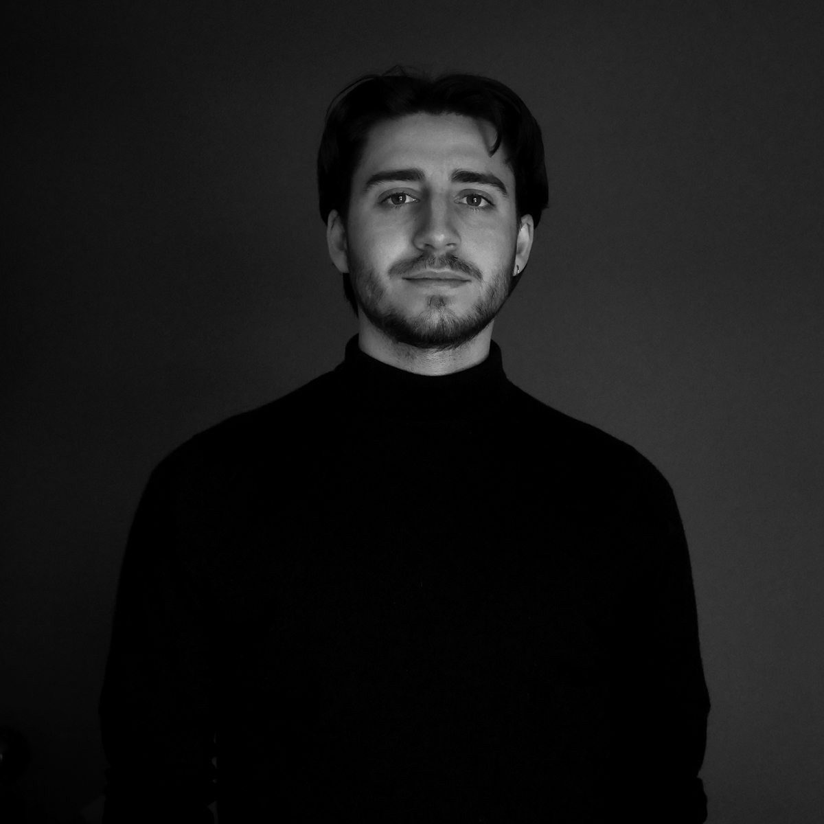
by Romain Tronchin