205 Corp.
24, rue Commandant-Faurax
69006 Lyon
France
T. 33 (0)4 37 47 85 69
M. contact@205.tf
Newsletter
205 Corp.
24, rue Commandant-Faurax
69006 Lyon
France
T. 33 (0)4 37 47 85 69
M. contact@205.tf
Newsletter
Maax Raw is a new variation of the Maax typeface that from the very beginning has had the ambition of questioning the status of sans serif typefaces and the importance that has been accorded to them. Each instance (Maax with its three style sets, Maax Mono, Maax Rounded and Maax Display) plays with the idea that a single sans serif character can not be enough if it doesn’t “reinvent” itself.
Maax Raw is a “crude” version of the typeface Maax. Its design is intentionally more stripped back, the optical corrections inherent to this type of character are almost completely absent, with the forms being even more closed. The font is blacker, more mechanic. Nevertheless, upon closer inspection, certain letters reveal a boldness that gives the character its particular rhythm. Certain forms are brought together even though they might seem a little foreign. The influences are many and sometimes bring to mind a vernacular drawing found on a plaque of the subway in Berlin or a strange Swiss signpost. Maax Raw exists in seven styles (regular, italic, rotalic, bold, bold italic, bold rotalic and stencil bold). A unique family to be used in projects of visual identity or communication that will stand out.
This dingbats typeface responds efficiently to what a lot of designers seek: choose a series of arrows that adapt themselves precisely to any character that has previously been retained. Up to now this kind of typeface has not been enough and has rapidly revealed itself to be insufficient: the number of arrows proposed is ultimately quite limited.
This typeface proposes a much greater number, thanks to a misuse of OpenType technology. In effect, it is not a new typeface that proposes a renewed batch of arrows. It is not in fact a tool that allows the designer to compose an infinite number of arrows. Through a logical set that uses the keys on the keyboard, the designer could/can choose the different elements that make up an arrow: tail, body and point.
The arrows are automatically composed thanks to more than 5,000 kerning pairs. The user can not only choose the style of an arrow but also its length (by composing a number of successive elements) and its direction (towards the left or the right using capitals and lowercase characters).
Though there may be a certain learning curve associated with the use of this typeface, the result ultimately reveals itself to be well worth the time and effort!
In order to further extend the possibi-lities of use of the Maax typeface, we have added an IPA (International Phonetic Alphabet) phonetic version, useful for the composition of linguistic works. Like all IPA typefaces, this version of Maax only exists in Regular style.
This phonetic version adds to the fact that the Maax typeface is appreciated by graphic designers and publishers for its great versatility. On its own, it can be used for many purposes and situations. There is no need to change the typeface or combine it with a second one when specific characters are needed. Maax IPA completes the Maax type family, which already possessed a number of different variants.
Could lone typeface with no serifs be enough for a designer? It is the basis of this seemingly uninteresting question that Damien Gautier really got down to work to develop this typeface with its multiple facets. Thanks to the OpenType format, he first developed 4 series. “Standard”: a set of characters that are intentionally all purpose; “Géométrique”: a set of characters with elementary forms that bring to mind the first typographic experiments of the Bauhaus; “Moderne”: domesticated forms that refer more to characters such as the Futura and the Nobel; “Grotesk”: here, more designed/drawn forms close to the intentions that were at the origin of characters such as Helvetica or the Akzidenz Grotesk. Four typefaces in one to some extent, accessible thanks to the “Stylistic set” function of the OpenType format.
Finally, the demonstration is made: with a single typeface, we can indeed have many possibilities!
This typeface takes its inspiration from the characters that one can find on the nameplates of French streets. For a long time, Damien Gauthier has been interested in these letters that everyone sees on a daily basis without really knowing them. No one seems to pay them any attention and yet they reveal themselves to be particularly interesting due to their great diversity. Though we can imagine that it is always a question of the same typeface, a closer study shows that a number of alphabets co-exist. One common point: elementary, robust forms, that seem more to have been traced than drawn by a few industrial draughtsmen, eager to be able to compose names of streets, avenues and boulevards in the restricted space of a standardised enamelled plate (well almost, this is France after all!)
It is definitely not a question of smoothing out and unifying all of the drawings finishing with a slick and homogenous typeface! On the contrary, Damien Gautier wants these typefaces to conserve the disparity of the typographic forms that have been noted.
In an apparent logic of organisation and of design that somewhat amusedly reminds us of the method used by Adrian Frutiger for the Univers typeface, the different series of the Plaak conserve the independent designs in a certain number of details (accents, the specific forms of a few letters: G, K, M, Q, R, etc.)
This typeface is composed of 24 styles that display the typographic wealth of this source of inspiration.
“Plaak 1 – Sathonay”: very narrow characters;
“Plaak 2 – Griffon” and “Plaak 3 – Pradel”: narrow characters;
“Plaak 4 – Terme” and “Plaak 5 – Foch”: wide characters;
“Plaak 6 – Ney”: extra-wide characters.
Each serie (from 1 to 6) contains a number of weights and a set of capital and small capitals (because the lowercase letters were almost completely missing from French street signs). By activating the “Ligatures” function, a particular series of ligatures refer to the origin of this typeface…
Thanks to its many variants and its design that is rid of any outdated pastiche, this typeface reveals itself to have a large range of possible uses: press, publishing, signage, visual identity.
An enhanced version of lowercase letters is currently being studied. Its launch is planned for 2018.
With the efficient and precious help of Roxane Gataud.

Maax Unicase is a new extension of the Maax type family. It is clearly a titling variant that asserts a certain originality by having only capital letters which occasionally borrow from the forms of minuscule letters. Available in two weights – Bold and Black – this version presents a design which is particular in a number of areas, and its use will not go unnoticed. Damien Gautier has for example made the choice to emphasize certain details present in the original typeface and to emphasize its originality when compared to other available sans-serif typefaces.
Like the Maax typeface, this Unicase version also has alternative characters. Although fewer in number, they allow for a large number of variations and to adjust the silhouette of words. This typeface will clearly be suitable for the composition of titles and the creation of logotypes.
To distinguish it even further, the accents and all of the diacritical marks have a particular design. Particularly thin and not very cumbersome, they make it possible to reduce line-spacing and to obtain a dense composition which is appropriate to the spirit of this typeface with its intentionally reduced letter-spacing.
This stencil type character is developed in 3 “Capital” series that stand out for their terminations. “Cut”: beveled edges, “Rounded”: rounded edges; “Sharp”: sharp edges.
The accents on the capitals were studied to allow a dense composition that suits this typeface. "Lowercase” is a 4th series that proposes a complete typeface with lowercase letters.
It is a relatively black typeface that best suits the composition of titles or the design of visual identities.
With the efficient and precious help of Roxane Gataud.
Could lone typeface with no serifs be enough for a designer? It is the basis of this seemingly uninteresting question that Damien Gautier really got down to work to develop this typeface with its multiple facets. Thanks to the OpenType format, he first developed 4 series. “Standard”: a set of characters that are intentionally all purpose; “Géométrique”: a set of characters with elementary forms that bring to mind the first typographic experiments of the Bauhaus; “Moderne”: domesticated forms that refer more to characters such as the Futura and the Nobel; “Grotesk”: here, more designed/drawn forms close to the intentions that were at the origin of characters such as Helvetica or the Akzidenz Grotesk. Four typefaces in one to some extent, accessible thanks to the “Stylistic set” function of the OpenType format.
Finally, the demonstration is made: with a single typeface, we can indeed have many possibilities!
Could lone typeface with no serifs be enough for a designer? It is the basis of this seemingly uninteresting question that Damien Gautier really got down to work to develop this typeface with its multiple facets. Thanks to the OpenType format, he first developed 4 series. “Standard”: a set of characters that are intentionally all purpose; “Geometric”: a set of characters with elementary forms that bring to mind the first typographic experiments of the Bauhaus; “Modern”: domesticated forms that refer more to characters such as the Futura and the Nobel; “Grotesk”: here, more designed/drawn forms close to the intentions that were at the origin of characters such as Helvetica or the Akzidenz Grotesk. Four typefaces in one to some extent, accessible thanks to the “Stylistic set” function of the OpenType format.
Finally, the demonstration is made: with a single typeface, we can indeed have many possibilities!
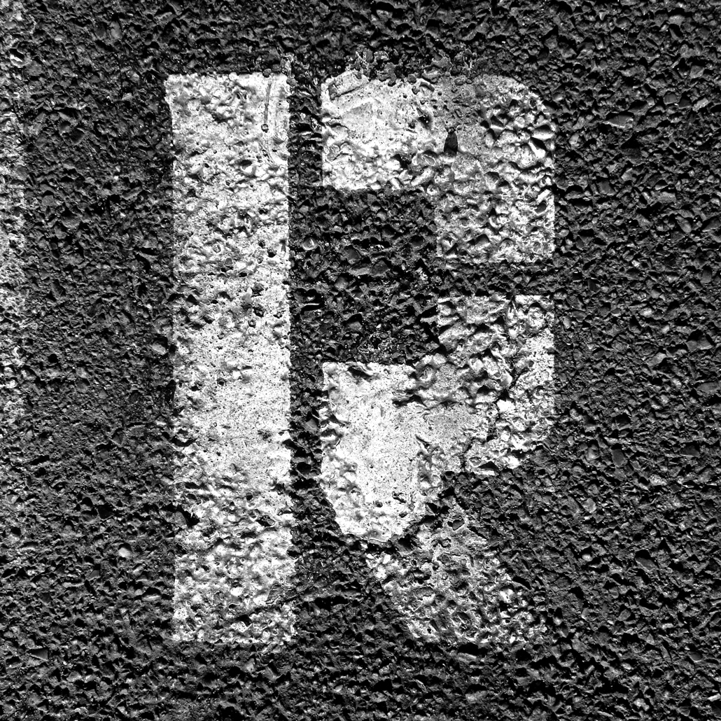
The Amiral character emerged from the discovery of the vestiges of a few letters painted on the ground. They seem to have resisted surprisingly well to time and the repeated passing of vehicles. We can still make out the rudimentary design of the letters, doubtlessly cut out of a metal plate.
This stencil typeface stands out for the robust nature of its letters that bring to mind markings on the side of cargo containers. However, this character is also used for punctuation.
Though this typeface may only be composed of capital letters, it does however contain a certain number of alternative signs.
With the efficient and precious help of Roxane Gataud.
Plaax (with an x) is an extension of the typeface Plaak (with a k) completed with lowercase letters. Plaax is a large family of 20 cuts.
This typeface takes its inspiration from the characters that one can find on the nameplates of French streets. For a long time, Damien Gautier has been interested in these letters that everyone sees on a daily basis without really knowing them. No one seems to pay them any attention and yet they reveal themselves to be particularly interesting due to their great diversity. Though we can imagine that it is always a question of the same typeface, a closer study shows that a number of alphabets co-exist. One common point: elementary, robust forms, that seem more to have been traced than drawn by a few industrial draughtsmen, eager to be able to compose names of streets, avenues and boulevards in the restricted space of a standardised enamelled plate (well almost, this is France after all!)
It is definitely not a question of smoothing out and unifying all of the drawings finishing with a slick and homogenous typeface! On the contrary, Damien Gautier wants these typefaces to conserve the disparity of the typographic forms that have been noted.
In an apparent logic of organisation and of design that somewhat amusedly reminds us of the method used by Adrian Frutiger for the Univers typeface, the different series of the Plaax conserve the independent designs in a certain number of details (accents, the specific forms of a few letters: f, g, j, k, r, t, y, etc.)
This typeface is composed of 20 styles that display the typographic wealth of this source of inspiration. “Plaax 1 – Sathonay”: very narrow characters; “Plaax 2 – Griffon” and “Plaax 3 – Pradel”: narrow characters; “Plaax 4 – Terme” and “Plaax 5 – Foch”: wide characters; “Plaax 6 – Ney”: extra-wide characters.
Each series (from 1 to 6) contains a number of weights. By activating the “Ligatures” function, a particular series of ligatures refer to the origin of this typeface…
Thanks to its many variants and its design that is rid of any outdated pastiche, this typeface reveals itself to have a large range of possible uses: press, publishing, signage, visual identity.
Le François is a unique typeface for several reasons.
Firstly, it only contains capital letters, in three distinct series: uppercase, “high” and “low” small caps. However, the capitals are in strong contrast to ancient historical engravings. With its geometrical form, Le François echoes French characters such as Peignot, and its contrast between thick and thin strokes evokes the elegance of letterings such as Yves Saint-Laurent, also created by Cassandre.
Secondly, thanks to several ligatures and its specific spacing, you can compose distinctive words and titles. Just as Avant Garde Gothic, it plays with the strong contrast in lighting created by the capital letters, resulting in a dynamic graphic rhythm.
The synergy created between classic French and more modern references give this typeface a strong personality. Le François can therefore be an alternate typeface in many historical and patrimonial contexts. It is also perfectly adapted to fashion, luxe and gastronomy, as it distinguishes itself not only by its elegance, but also its bold audacity.
Maax Mono is a variant of Maax “with a fixed set-width”. In order to emphasize its mechanical character, Damien Gautier has chosen to “harden” the strokes while intentionally, but not systematically, creating black “stains” in some areas, as if to recall the origins of typewritten typefaces. In addition to a particular rhythm specific to such typefaces, texts composed with Maax Mono possess a highly original color. Developed in direct relation with Maax, it could provide a variation when the latter is already being used. Their identical vertical proportions simplify the simultaneous use of the two typefaces.
Maax Mono is a type family originally composed of four styles—Regular, Italic, Bold and Bold Italic—more than enough for this intentionally rough typeface.
In 2021, Damien Gautier added two styles – Stencil and Semi-Stencil – increasing the range of use and scope of this typeface. In addition to developing a strong personality, these two new variants allow one to consider using the typeface as reversed type, or with stencils. With the arrival of these two new styles, Maax Mono could easily be used as a typeface for titles or for signage.
Maax is a sans-serif typeface whose design possesses few optical corrections so as to give it a certain obviousness and authenticity. Consequently, certain counterforms are relatively small, and can even become clogged when its size is reduced, or when the medium upon which the typeface is printed makes for an imprecise result.
As its name indicates, Maax Micro is a variant of the Maax typeface, specially designed for use with small and very small sizes. Inktraps, invisible to the naked eye at sizes below 8 points result in more open counterforms. These traps are designed to function by “absorbing” the ink that would otherwise build up, clogging the counterforms.
The spirit of the original typeface remains intact. Maax Micro possesses exactly the same palette of signs as Maax, including the many alternative signs that make it so original. However, some will appreciate these surprising, sometimes extravagant forms, caused by the addition of these ink traps, modifying the principal function of this Micro version and setting the typeface in large sizes, using it as an original titling typeface.
Could lone typeface with no serifs be enough for a designer? It is the basis of this seemingly uninteresting question that Damien Gautier really got down to work to develop this typeface with its multiple facets. Thanks to the OpenType format, he first developed 4 series. “Standard”: a set of characters that are intentionally all purpose; “Geometric”: a set of characters with elementary forms that bring to mind the first typographic experiments of the Bauhaus; “Modern”: domesticated forms that refer more to characters such as Futura and Nobel; “Grotesk”: here, more designed/drawn forms close to the intentions that were at the origin of characters such as Helvetica or Akindenz grotesk. Four typefaces in one to some extent, accessible thanks to the “Stylistic set” function of the OpenType format.
Originally this typeface contained 4 weights and 7 styles: regular and italic, medium and medium italic, bold and bold italic, black. A fifth weight has been added with a light version. A display version – particularly black – was designed, leading to sometimes surprising choices. This version conserves a number of sets of characters and a certain number of alternative letters.
Finally, the demonstration is made: with a single typeface, we can indeed have many possibilities!
With the efficient and precious help of Roxane Gataud and Corentin Moyer.
The CX80 typeface is a “machine”* as rudimentary as it is atypical. Four kinds of serifs are combined in the same font: sans serifs, triangular serifs, sharp rectangular serifs, and smooth rectangular serifs. Each letter can exhaust all possible combinations: up to 256 variations for any one sign!
The user is free to play with the possibilities provided by the typeface. Either they choose to be an iconoclast by associating different serifs (simply using their keyboard), or they may prefer one of the four basic styles that correspond to each of the serifs.
Behind this intentionally economic design, CX80 reveals a unique potential; particularly as weight can be adjusted at will using variable font technology.
CX80 reveals its formal and conceptual sources of inspiration through its modular and composite appearance. The name openly refers to the Codex 80 type classification imagined by Jean Alessandrini** in 1980. Seeking an alternative to traditional classifications, he proposed a new taxonomy adapted to the typographic renewal of the time.
A second influence is the modding of scooters. During the 1980s (when Damien Gautier was old enough to buy his first Piaggio Ciao), teenagers were in the habit of customizing their mopeds by adding functional and decorative elements. This culture of outrageous tinkering and modding also runs through the typeface.
With CX80, Damien Gautier continues his exploration of vernacular typographical forms produced by amateurs and industrial designers. Forms that he loves for their freshness and ingenuity, that here once again show their surprising potential.
* CX80 echoes other typefaces by Damien Gautier: LeChaufferie, Robin, and Heliuum.
** Jean Alessandrini (1942), French typographer, illustrator, and writer.
This concise typeface was originally designed for the eponymous city in Bourgogne, in 1995. Ultimately it was never used as planned for the signage in the municipal buildings.
In 2011, Damien Gautier completely overhauled this typeface to make it more lively. Its design has become simplified and stated. A number of details reveal surprising choices for this typeface that nonetheless retains its engraved origins. The numerous ligatures are a clear sign of this.
With the efficient and precious help of Roxane Gataud.
This typeface is based on the Maax, designed by Damien Gautier in 2012. It is a typeface with more convivial, naturally rounded terminations. Like the Maax, this typeface contains a number of sets of characters that give each one a rhythm and a particular colour to text.
The Maax Rounded is available in 3 weights and their italics: regular and italic, medium and medium italic, bold and bold italic.
With the efficient and precious help of Roxane Gataud and Corentin Moyer.
This character is composed only of points whose diameter creates an optical effect It is developed in three weights: light, regular and bold. Contrary to what we might think, the Beretta is not a modular character. The points are placed in an optical fashion so as to optimise the regularity and legibility of each sign.
As if to affirm its originality, this character is developed in two styles: sans serif and serif. This character, a priori used for titles, reveals itself to function particularly well when it is used in small bodies.
With the efficient and precious help of Roxane Gataud and Corentin Moyer.
Alcalá is based on the “Biblia poliglota complutense” (Polyglot Bible of Alcalá). It was the first edition of a complete polyglot Bible, as well as the first printed version of the New Testament in Greek (Septuagint) with gloss. Conceived between 1502 and 1517, it was produced under the patronage of Cardinal Francisco Jiménez de Cisneros.
The first drawings of Alcalá go back to 1995. A second version started in 2011, commissioned by a publisher for a French
and Malagasy edition of the Bible by J.N. Darby. Alcalá was developped in three styles: roman, italic and bold. Today, a new cut is added: Alcalá Black Display, its intended to compose titles and headings.
Alcalá has all requested qualities for editorial design, especally newspaper and magazine layouts. Its sharp design guarantes high readability, space saving and smart printed rendering in small sizes, as well as a great look in bigger uses. Look at its alternative punctuation! For book design, Alcalá Roman contains titling capitals and its Italic contains a serie of special ligatures.
While other characters has extended families, Damien Gautier decided to develop a reduced one. Alcalá has the only the cuts you need!
As every 205TF typefaces, Alcalá has an extented Latin glyphset which allows to compose many languages.
This typeface is based on the principle – apparently simple but ultimately quite complex – of layering of letters. Each letter is effectively layered upon the previous one and this systematically creates encounters that are automatically corrected by more than 1,200 ligatures. The addition of alternative letters allows the result to be perfected. The Opentype format and the associated functions render the use of this typeface almost child's play.
With this typeface, Damien Gautier was awarded the “Bukva:raz !”, ATypI 2002 prize for excellence.
With the efficient and precious help of Roxane Gataud.
Heliuum (with two u), designed by Damien Gautier in 2021, is not just a single font, it’s a playful typographic program. Indeed, behind simple but strong and determined shapes, this typeface contains seven different character sets.
Three ranges of uppercases evolve on three different heights. Four ranges of small capitals are standing on four different baselines aligned from the bottom to the
top of the taller uppercases.
A close look allows us to identify a precise goal from the type designer. Letters are not optically corrected, but many details give delicacy to its rugged shapes. Heliuum stands voluntarily between the mechanical and the sophisticated.
Thanks to OpenType ligature function, all combinations are directly accessible on the keyboard and the users compose texts as if they were playing the piano.
With a constant stroke thickness between the seven series and a similar width between uppercases and small capitals, letters align easily vertically and the designer immediately obtains dynamic compositions.
Heliuum is obviously a display type, conceived especially for magazines and their headings. Its seven series come with specific ranges of punctuation, creating infinite combinations. With its two weights (ExtraLight and Regular), art directors will love this font to compose dynamic and innovative typographic layouts.
Because of its strong identity and the originality of its letter arrangement, what if Heliuum could also be useful for creating brand identities?
Heliuum is also developed as a variable font. Web designers will appreciate the ability to dynamically vary the weight of the letters in order to bring movement to their compositions.
A display version – particularly black – of the well-knowned font Maax was designed, leading to sometimes surprising choices. This version conserves a number of sets of characters and a certain number of alternative letters.
This stencil type typeface stands out for its geometrical structure and its elementary forms. However, a number of details seem to show what Damien Gautier was by characters of body type to determine his choices. Rare indeed are characters of this type that possess oldstyle numbers and ligatures that are usually reserved for historical characters!
With the efficient and precious help of Roxane Gataud.
This character is composed only of points whose diameter creates an optical effect It is developed in three weights: light, regular and bold. Contrary to what we might think, the Beretta is not a modular character. The points are placed in an optical fashion so as to optimise the regularity and legibility of each sign.
As if to affirm its originality, this character is developed in two styles: sans serif and serif. This character, a priori used for titles, reveals itself to function particularly well when it is used in small bodies.
With the efficient and precious help of Roxane Gataud and Corentin Moyer.
No font yet!