205 Corp.
24, rue Commandant-Faurax
69006 Lyon
France
T. 33 (0)4 37 47 85 69
M. contact@205.tf
Newsletter
How did you get involved with typeface design? What led you to this practice?
For as long as I can remember, the form of letters and their visual understanding has always been a cornerstone of my education and my practice. I graduated from the lycée Auguste Renoir, where I learned page layout by hand, with a two year technical degree as a draughtsman and layout artist in 2004. We had to design documents and double page spreads for books and posters, reproducing all of the content, both iconographic and textual, by hand. For example, we had to stimulate the bulk and type color of the blocks of text with Tria felt tip pens that were lighter or darker depending on the subject. Pursuing this path, I continued my studies at the École nationale supérieure des beaux-arts of Lyon, graduating in 2011, where I learned to work with digital typefaces and where my interest for editorial design was confirmed. Then in 2016, it seemed logical to me to apply to the Atelier national de recherche typographique, which I joined in October of that year, in order to learn how to design typefaces, the idea being to embark on a deeper exploration of my infraordinary practice as a Graphic Designer.
What influences you? Are there typeface designers whose work you appreciate in particular?
The work of Matthew Carter interests me greatly on a number of levels, notably because he experienced all of the steps in the history of typography, and the different techniques of the design and production of typefaces, from lead to light and then digital, and this brings incredible depth to his work. I am impressed by the precision of his design: his line is clear and precise, similar to the gesture of a sculptor. The work of Fred Smeijers also speaks to me for its sense of rereading history, that of Kris Sowersby for his way of conceptualizing a project, the work of Laurenz Brunner for its freedom and its experimentation, and finally the work of Australian Vincent Chan for the diversity of the forms that he designs.
I also have a lot of interest for domains quite far removed from typography, such as literature, occult sciences, psychology and astronomy, as much to nourish my practice as to gain some distance from it, so that my designs are not only a consideration of typefaces for typographers.
In your opinion, what is the point of creating a new typeface when so many already exist?
I don’t look at type design through the lens of utility but rather through that of desire. For me, I design what I want to see, no doubt in reaction to things that I don’t want to see or that I wouldn’t know how to use.
One of the analogies that I find most telling is that of designing chairs. The structure is rarely renewed, but there are always new needs: technical, aesthetic, conceptual...
Is it really possible to create something new in the field of typeface design?
I don’t think that it is possible to create something totally new from a structural point of view, given that the forms of letters haven’t evolved for quite some time now, and one must conserve this structure if one wants the letters to be comprehensible. However, I think that it is possible to engage in a broad exploration of diverse terrains through the conceptualization of type designs, which is what I am trying to do with the Immortel project.
Today I look at the work of type design similar to how American composer William Basinski approaches his Disintegration Loops: they are basically loops of music stored on magnetic tape that he wished to preserve by making digital recordings of them. Every time the tape passes the read head it is damaged and the sound altered, which gives each loop a different grain, a different texture to the one that came before. Each loop is unique without being radically different to the others.
How do you begin work on a new typeface? Do you have a particular process?
My approach is totally empirical and my reasons for beginning a new typeface vary greatly. For example, one of the reasons behind the design of Immortel Infra came from a longstanding interest for the Galliard, Plantin and Lyon typefaces. Having worked with these typefaces on different projects, I realized that none of the three truly incarnated what I was looking for when using typefaces descended from those of the French Renaissance, forms that were present enough to be visible but sufficiently discreet to go unnoticed. The need for this type design arose from the desire to develop a personal version of Robert Granjon’s Gros Cicéro, engraved in 1569, which influenced the three typefaces previously mentioned.
What is your relationship with the history of typography? What is your relationship with technology?
A knowledge of the history of type design is certainly the most important thing when one decides to engage in the design of typefaces, as it helps us to understand what we do, to position ourselves and affirm a direction; I took advantage of my time at the ANRT to deepen my knowledge of typography and history.
My relationship with technology is slightly different. Though it is important to know how to handle the tools that one chooses, so as not to be held back by them, I have no interest in being the biggest nerd possible; I simply wish to understand what I am using and why I am using it as a function of my needs.
Why have you chosen to distribute your characters and typefaces with 205TF?
205TF’s openness to experimental projects seemed appropriate to me for the Immortel project as it is a quite particular design. It is at the same time a classic exercise of revival, of exploring the architecture of a type family, and an approach to the formal incarnation of a very ancient theory light years away from type design.
Do you think that typography can save the world?
I have an ambivalent stance on the question. In 2006 type designer Peter Biľak wrote in the first issue of the magazine Marie-Louise: “We type designers might be convinced that our profession is vital to society, but we wouldn’t risk going on strike to test how indispensable we really are.” From this point of view, to which I adhere, I place type design on the same level as all other artistic creation. I don’t know if it can save the world, but it does make it richer, more tolerable, deeper. To quote the words of artist Robert Filliou: “Art is what makes life more interesting than art”.
Nevertheless, as letters represent the smallest unit of communication, it is hard to underestimate their role in the development of societies.
Do you teach? If so, where, and why does this role of transmission seem important to you?
I taught editorial design at the École européenne supérieure de l’image of Poitiers for 3 years. I taught page layout to art students, so that they could use it for the graphic and editorial design of their dissertations, but also to provide them with a sufficient enough base to design the documents that artists need all throughout their careers: presentation documents for applying for projects, for residencies, etc. I took a technical (learning the basics of InDesign and Photoshop), historical (the history of typography) and conceptual (what is the most pertinent form that can be used to deploy their dissertation in an editorial form?) approach to transmission. I teach Glyphs typeface design software, its history and its implications. I also animate workshops in editorial design and type design in various schools. These experiences are extremely enriching as I find that I learn just as much as the people that I am teaching. I have never questioned or challenged the role of transmission of knowledge as it has always been present, and is an essential factor in the development of human beings and society. By teaching it I make a humble contribution to its development.
What type design project are you currently working on?
After five years of intense work and research on the Immortel project, I need to work on something lighter. I am currently working on around ten typefaces, and I allow myself to move forward, or not, depending on the historical and formal depth that they might provide but also depending on the interest shown by my fellow Graphic Designers.
Fonts
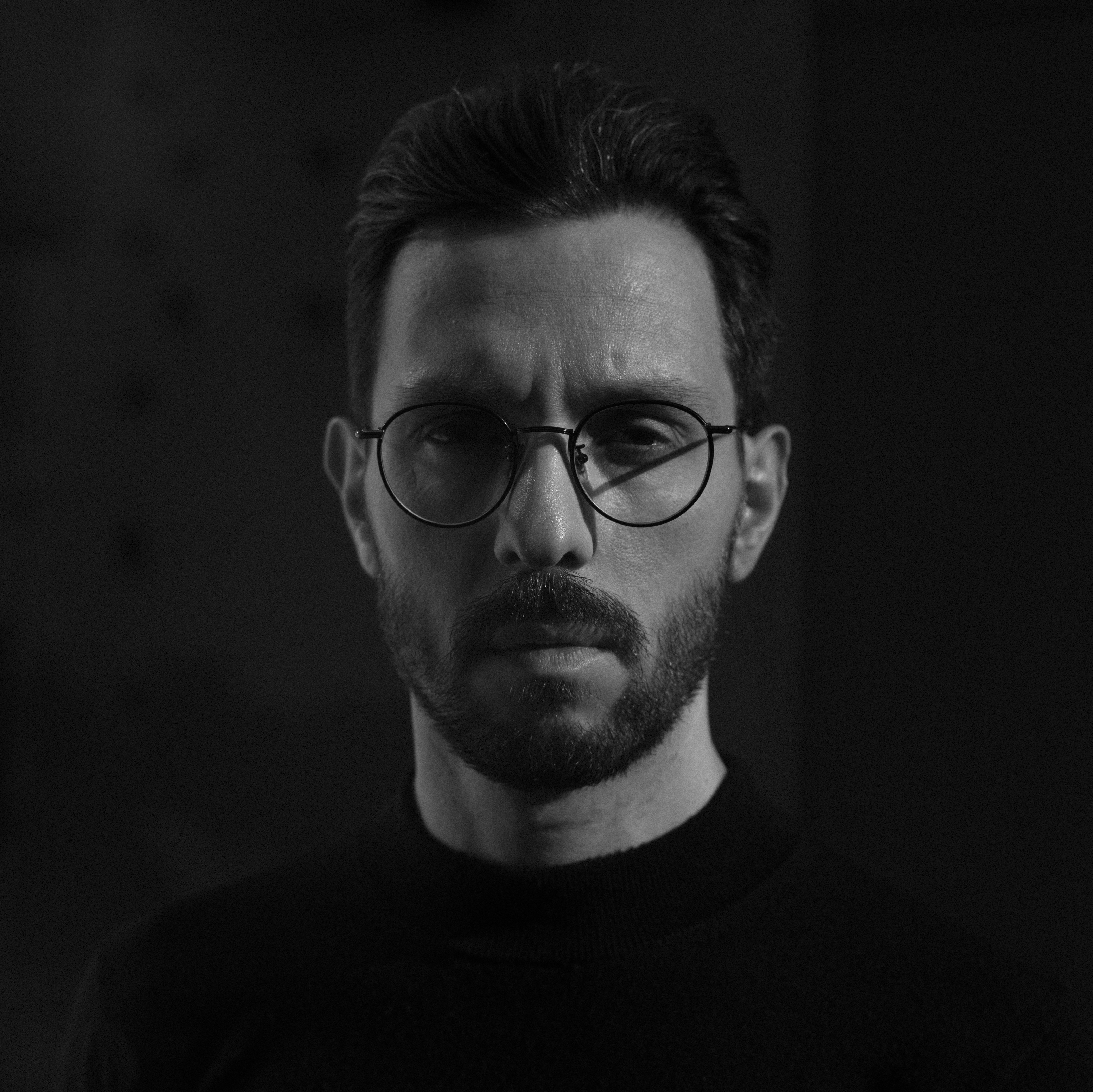
by Clément Le Tulle-Neyret