205 Corp.
24, rue Commandant-Faurax
69006 Lyon
France
T. 33 (0)4 37 47 85 69
M. contact@205.tf
Newsletter
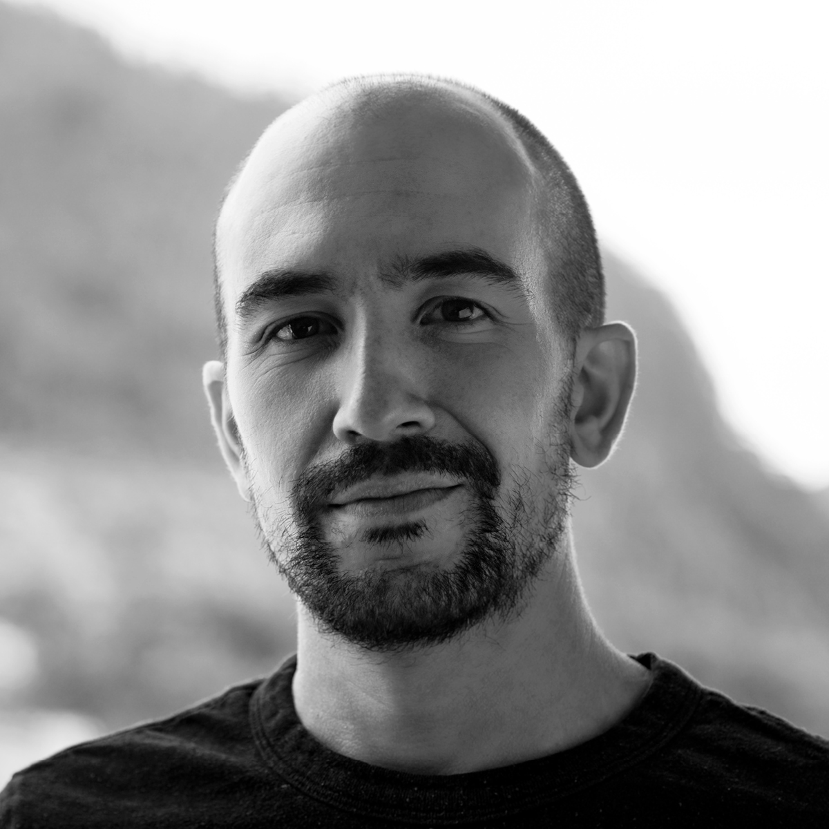
How did you get involved with typeface design? What led you to this practice?
It wasn’t until the last year of my design studies that I became interested in typography. I intended to make a font as a final project but my professors discouraged me, arguing that it was a very complex process. After my studies, I went to live in Mexico where for the first time I met type designers who motivated me to try. I was fascinated by type and I decided to become a self-taught part-time type designer. A few years later I had the opportunity to do the Type@Cooper Condensed program in New York City. This life-changing experience made me want to keep studying to become a full-time type designer. For this reason, I decided to apply to the Atelier national de recherche typographique (ANRT) where my typeface Exposure was born.
What influences you? Are there typeface designers whose work you appreciate in particular?
I usually let my creative process be influenced by things beyond the world of typography, such as film editing, sculpture practice, photographic processes, or optical effects, just to name a few. I could name Adrian Frutiger as a major influence, but in the end, some of my teachers and colleagues have had an equally relevant influence. Naming some will mean leaving others out. But I can say, for very different reasons, that I appreciate what Philipp Neumeyer, Wael Morcos, Fabiola Mejía, Tezzo Suzuki, Connor Davenport, and Fer Cozzi are doing.
In your opinion, what is the point of creating a new typeface when so many already exist?
I’ve heard many answers to this question by type designers who try to justify what we do, arguing that typefaces are tools that need to respond to our current times. However, I think the question and those answers assume that typefaces are designed solely from a utilitarian perspective. Instead, I prefer to think of my craft from an artistic point of view, like that of a sculptor who gives form to language, as a means of expression within some formal and technical constraints.
Is it really possible to create something new in the field of typeface design?
I believe that the opposite is impossible since the very definition of creating refers to novelty. A type designer who makes a “revival” of an old font is creating something new since he is interpreting forms that he did not conceive in its beginnings. It is even possible to find designers who re-draw one of their fonts to improve it, resulting in a new typeface. Even copies of existing fonts such as Arial or Book Antiqua end up being independent creations of Helvetica and Palatino, beyond their intrinsic value. What I find most interesting about typeface design is how to draw that line between what can be considered plagiarism, derivative work, or original creation, knowing that the more one moves away from the conventional forms, the more difficult it will be for the reader.
How do you begin work on a new typeface? Do you have a particular process?
If it is a self-initiated project I always start by experimenting. I may have a rough idea of what I want and I start by trying to shape it. Without refining, I try to go back and forth between hand drawings and vectors to define a clearer concept. At this point, I start drawing different font alternatives that correspond to this concept. Over time I discard them except for the one I see the most potential in. I try to start defining the features of the typeface and not focus on the details. Sometimes I move forward without knowing where I want to go, letting accidents happen because it is usually in this way that I rule out the most obvious solutions and discover the most interesting ones.
What is your relationship with the history of typography? What is your relationship with technology?
I am curious about the history of typography and like to understand the details of why certain typefaces were drawn a certain way. I may find historical periods useful as a starting point for a project, but I try not to stay there and move on quickly. By contrast, type design technology, both historically and in the present, has had a greater impact on what I do. For my Exposure typeface, for example, I have tried to play the role of a metal punch-cutter who is aware of the effects of photocomposition and represents them in variable vectors, imagining future forms of interpolation. Having worked as a font developer, I am more aware of new formats and how to push the limits of current type technology.
Why have you chosen to distribute your typefaces with 205TF?
Unlike other foundries, it seems to me that research and experimentation prevail over commercial interests in 205TF’s catalog. Some of my professors and the type designers I admire the most publish in this foundry. For these reasons and also as gratitude for the years I lived and studied in France, it seemed to me that this was the ideal place to publish.
Do you think that typography can save the world?
Isn’t it already the case?
Do you teach? If so, where, and why does this role of transmission seem important to you?
I don’t currently teach, although a dream I have is teaching in something similar to the ANRT. Previously I have been a part-time teacher and have also taught workshops, but never in typographic design. I believe that the interaction you have with a student can be as enriching for the one who is “teaching” as for the one who is “learning”, and sometimes both tend to blur. I feel that the best pedagogical environments are those that seek less a vertical transmission of knowledge and instead promote understanding through practice and conversation.
What type design project are you currently working on?
I’m working on an Arabic font to which I am planning to add optical sizes as well as a Latin character set. I also have remnants of my research on the effect of light on sculpted forms: experiments with pixels, rotating interpolations, and color fonts. And apart from that, I have other undefined ideas with which I will still have to experiment.