205 Corp.
24, rue Commandant-Faurax
69006 Lyon
France
T. 33 (0)4 37 47 85 69
M. contact@205.tf
Newsletter
How did you get involved with typeface design? What led you to this practice?
After finishing my studies in Paris, I trained with Jean François Porchez, in order to concentrate mainly on typography and its applications. He taught me a very academic approach to type design and that was a real point of departure for me. Afterwards I decided to pursue my studies at the ECAL where I graduated in June 2017. While there I was lucky enough to be guided by renowned masters, such as François Rappo who taught me a lot and who helped me to have a keener eye, along with Kai Bernau and Matthieu Cortat.
What influences you? Are there typeface designers whose work you appreciate in particular?
All of the different professionals whom I met during my time studying in Lausanne were a source of inspiration at one time or another. Whether in the fields of photography, graphic design, or more specifically typography. The ECAL is in effect a highly enriching context where different disciplines intersect and overlap. We are very lucky to receive advice and guidance from people who are passionate about the work, coming from very different backgrounds, who nourish our thinking and help us to develop our practice. In general, I would say that I have a strong interest in type designers who are also graphic designers, like Christian Schwartz, Laurenz Brunner and Radim Pesko.
In your opinion, what is the point of creating a new typeface when so many already exist?
Typography is first and foremost a tool, with functionality and ergonomy being its two central pillars. Creating new typefaces allows new needs to be met, and allows us to provide our graphic design with a new identity. I don’t think that there is really any limit. I would even go so far as to say that it is important to develop one’s visual environment in line with one’s epoch. By renewing existing forms, one also renews the visual experience that reading can provide. Often, graphic designers know exactly what they are looking for but may sometimes opt for more intuitive choices.
Is it really possible to create something new in the field of typeface design?
It’s true, there are already a lot of typefaces available. But designers manage to create something new while being inspired by ancient forms. There are so many possibilities, there is so much left to explore! The typographic landscape that many describe as saturated forces designers to propose coherent projects with strong identities.
How do you begin work on a new typeface? Do you have a particular process?
In recent years I have been working essentially on revivals. The difference between the very precise trace of ink left by lead characters on vectorial drawing paper implies a complete deconstruction of the typeface in order to extract its essence. So it is essential for me to always see the printed version of my typeface, and to correct it by hand. I also try to consider all of the possible solutions, without modifying the original idea. For the Salmanazar typeface, the question of making it smoother was at the core of my process. I worked on a lot of versions before returning to my initial drawings. Ultimately, I chose to leave it with quite a rough appearance, with all of its imperfections and subtleties so that it could retain its quite sculpted appearance, and so that it would have a “taste”, a tone of grey different to what one usually finds.
What is your relationship with the history of typography? What is your relationship with technology?
Typography has its tradition, and always refers to a period of history. I believe that it is important to be aware of the context in which a typeface is created, to understand its origins and to attempt to know where its proportions come from, to understand the intentions behind it, etc. When one starts with an older model, one can find a wealth of information that will allow one to make one’s own interpretation. One discovers a multitude of subtleties that one might choose to emphasize, or not.
Digital tools are like any other tool. They allow for easy deconstruction and reconstruction, for the creation of variations – thanks to interpolations for example – to understand the impact of what one wishes to infuse them with. Today it is possible to “quickly” develop large families, even if I do think that it is more interesting to design and draw each style.
Why have you chosen to distribute your characters and typefaces with 205TF?
The Salmanazar typeface possesses a very strong identity. I don’t think that it would be at home in every kind of foundry. 205TF brings together independent designers with very different practices, but at the same time it continues to be a small foundry with a very precise selection. I think that Salmanazar really suits the catalogue. I would even go so far as to say that the project has been inspired by a French historical model and that I am really quite happy that it is distributed in France.
Do you think that typography can save the world?
I’m probably going to disappoint you here. I’m sure of it. But I will say that it enables communication, and that’s already pretty good!
Do you teach? If so, where, and why does this role of transmission seem important to you?
After my Master, the ECAL gave me the opportunity to do a six month residency in Hong Kong, where I gave conferences, organized workshops and worked with students in a design school. It was a very rich experience which allowed me to broaden my vision and to experience a new way of doing things, through the prism of the culture and heritage of a country. In addition to being very stimulating, it was a real challenge to teach as I had barely left school. I returned to France recently, and am certainly not objective enough, but what I can say is that sharing my experience and knowledge over there was a real pleasure.
What type design project are you currently working on?
I’m currently working on a customized version of a typeface for an Italian magazine that I started while still a student. Also I’ve taken charge of the development of an existing project. It is a little known Didot that proposes a particularly interesting version in terms of legibility.
Fonts
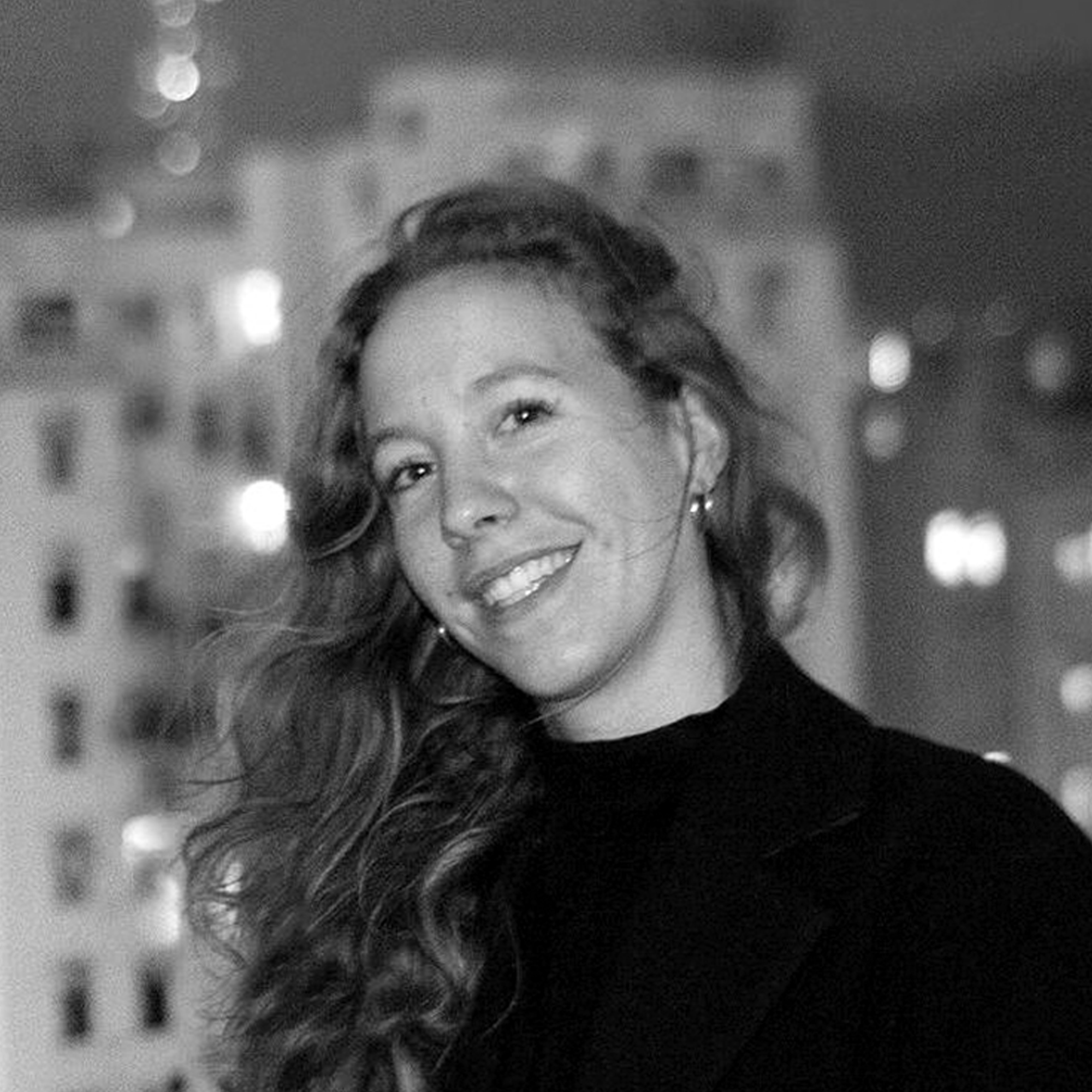
by Juliette Collin