205 Corp.
24, rue Commandant-Faurax
69006 Lyon
France
T. 33 (0)4 37 47 85 69
M. contact@205.tf
Newsletter
How did you get involved with typeface design? What led you to this practice?
I was lucky to be able to pursue two approaches to typography during my studies, one academic, the other irreverent. An initial teaching, combined with various workshops, allowed me to acquire technical and theoretical skills in typography, and Pierre Di Sciullo’s approach taught me how to move beyond an academic approach—to take a more radical formal and conceptual approach, emphasizing the reading experience over optimal legibility.
What influences you? Are there type designers whose work you appreciate in particular?
My references are quite diverse, I am interested in the variety of writing systems, as well as writing techniques and cryptography. Since 2012 I have been collecting a broad range of references together on a blog called Language as Symbols—there are so many surprises and treasures to be found in those drawings. I also appreciate audacious type designers who have surprising underlying themes and formal responses.
In your opinion, what is the point of creating a new typeface when so many already exist?
It is important to continue moving forward and to avoid reproducing historical forms that, in my opinion, belong to the past (the technical and cultural stakes have changed considerably), and it is important to question existing models. Typography, one of the mediums of language, should be constantly reconsidered so as to propose new reading experiences.
Is it really possible to create something new in the field of type design?
If one starts from the principle that a letter is arbitrary then one can take all kinds of liberties. So yes, many new propositions remain to be made in terms of type design. Only the reader’s level of resilience imposes current limits on reading.
How do you begin work on a new typeface? Do you have a particular process?
25% ideas + 25% rules + 25% testing + 25% production.
What is your relationship with the history of typography? What is your relationship with technology?
The history of typography is interesting, but should be taken as a starting point and not an end point. It is important to learn about it so as to establish a common culture, but one should move beyond it quite quickly in order to avoid reproducing anachronistic forms. Conversely, technique must always be a formal finality and thus, a point of arrival. In the sense that designed forms are infused with technology, it is interesting to play with them so as to discover new rules.
Why have you chosen to distribute your typefaces with 205TF?
It seems important for me to adhere to the same values as the type foundry that distributes my work: 205TF is a foundry that functions on a human scale, each project is valued and promoted, and the foundry proposes typefaces that are both aesthetically bold, and interesting in terms of technique.
Do you think that typography can save the world?
It is a pharmakon (a remedy to poison) as is every technical object. It allows one to spread knowledge on a large scale, but it also contributes to the spread of the worst myths. Typography is not only a tool, but also an instrument and content, it is equally the mediation and perception of said content—everything depends on “who” uses it and to what end.
Do you teach? If so, where, and why does this role of transmission seem important to you?
I teach in different schools, including in the master’s cycle at the ÉSAD Amiens. It is important on one hand to transmit our questions and our experiences to students, and on the other, to learn from them in return about issues linked to their current questions.
Fonts
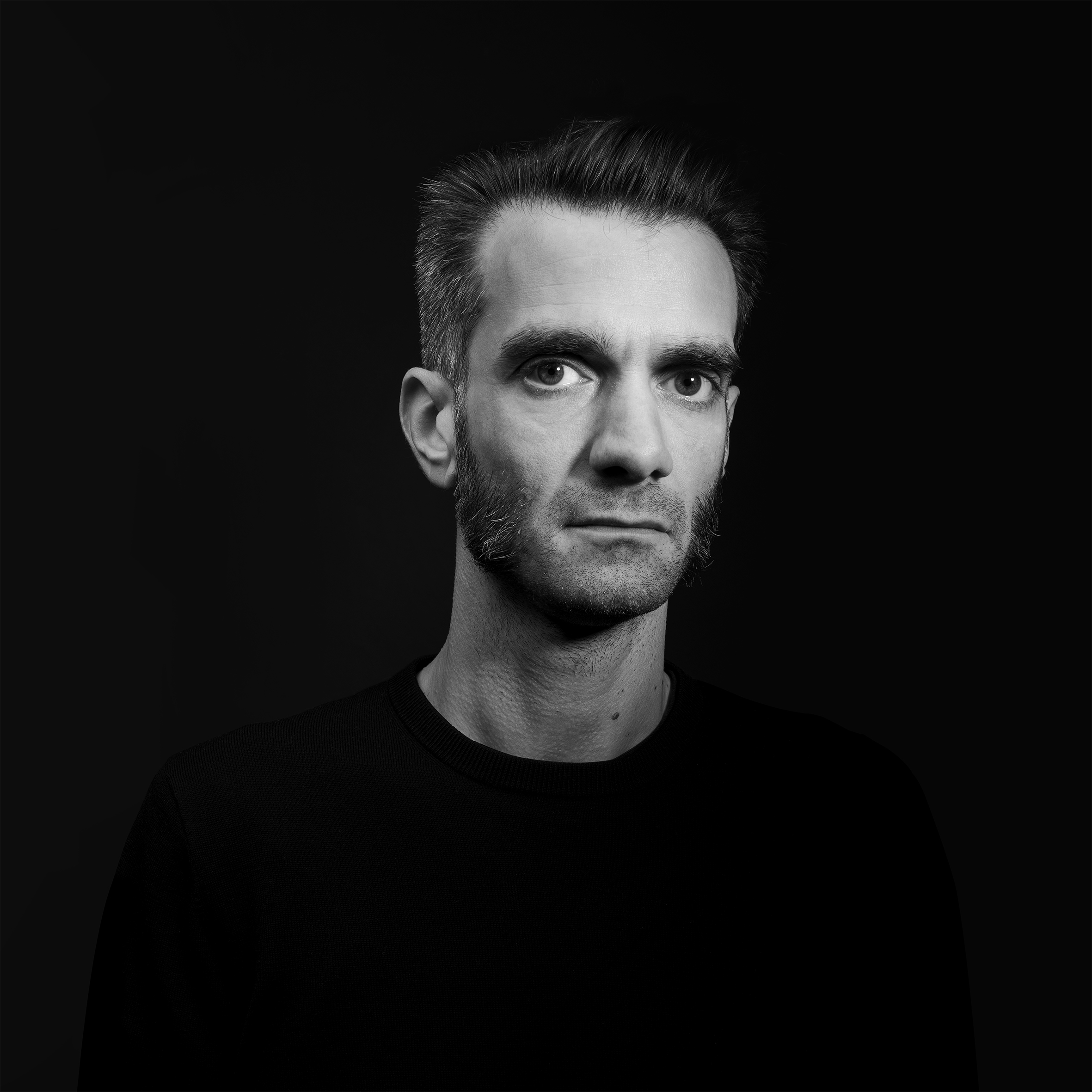
by Simon Renaud