205 Corp.
24, rue Commandant-Faurax
69006 Lyon
France
T. 33 (0)4 37 47 85 69
M. contact@205.tf
Newsletter
205 Corp.
24, rue Commandant-Faurax
69006 Lyon
France
T. 33 (0)4 37 47 85 69
M. contact@205.tf
Newsletter
Humanist Sans have sometimes a tendency to be over-roundish, slender, mannered,
mimicking the calligraphy. With Cosimo, Matthieu Cortat proposes a font in the spirit of Gill Sans, with strong shoulders, few contrast, a certain darkness in print, which gives it strength and serenity. Contrarily to many font of this style, its italic remains simple and quiet. With its clear and defined range of weights it possesses a versatility which makes it suitable for many purposes, book, titling, magazines, websites…
Nice light, straightforward Regular, virile Bold and peppy Black, each weight has a slightly different personality, but they match each others, making Cosimo a well grounded font for every-day use as well as dressed-up layouts.
Muoto is an extended type family, begun as a collaboration between Matthieu Cortat and the agency Base Design (Anthony Franklin and Sander Vermeulen). Published in 2021, Muoto has now been completed with three new set widths: Ultra Condensed, Condensed, and Extended.
Muoto is the synthesis of a sensitive and human approach to modernist design. This variable sans serif font combines full curves and solid stems, showing that functionalism can actually be warm and softly effective.
With its robust structure and subdued proportions, it evokes organic forms dear to Finnish architect Alvar Aalto, who in 1957 wrote: “we should work for simple, good, undecorated things, but things which are in harmony with the human being and organically suited to the little man in the street.”
Muoto embodies this idea while simultaneously responding to contemporary typographic standards with its range of weights (from Thin to Black) and now its four set widths (from Ultra Condensed to Extended), and everything is fully variable!
In 2009, when GVA Studio joined the Base group, it marked the Swiss studio’s entry into a network of international scope. With tongue firmly in cheek, Base Geneva designed a site to generate posters that played with stereotypes of Swiss style. Basetica “a Helvetica for the 2010s” was designed in this context, commissioned from Matthieu Cortat and distributed by 205TF a few years later.
In 2021, Base Design wished to redefine their typographic identity, and so the studio once again invited Matthieu Cortat to collaborate on a typeface to succeed Basetica.
What came next was a story of debates and questions, of micro-modifications and radical decisions, of discussions and rich debates.
In 2022, Matthieu Cortat began working on an extension for Muoto so as to offer designers a typographic tool with greater potential for expression and a wider range of applications. The Extended and Condensed styles resize letters to 20% of the standard proportions, while the Ultra Condensed design is even more radical as it assigns a single set width to the counterforms, regardless of weight. This “irregularity” in the definition of widths emerges from a typographic and visual logic rather than one based on mathematics, and allows designers to adjust both the set width and weight thanks to the variable font format.
Helvetius is a reinterpretation by Matthieu Cortat of a font used in a 1778 edition of De l’homme (On Man) by french enlightenment philosopher Claude-Adrien Helvetius. The title page of this book states that it has been printed in london. As for many of its kind, it’s probably a fake adress, often used by French publishers of that time to get rid of censorship. The type itself is clearly influenced by the style of Fournier Le Jeune.
Its italic, though, is definitely playful, Those features are kept in the classical yet sensitive digital revival. Slightly condensed, with a large x-height and two extra weights, it fits perfectly any jobing work in search of accuracy, classicism, but personnality and warmth as well.
A typographical “petite robe noire” which makes parisian women classy even for everiday life.
Zénith is a typeface intended for editorial design. Thanks to the possibilities offered by Variable Fonts format, Graphic designers can modulate both weight and optical size, transforming Zénith from a typeface designed for small sizes of body text into a particularly elegant and contrasted display typeface.
Here Matthieu Cortat delivers his personal interpretation of Zeno, a typeface cut by Charles Malin in 1936 for the German-Italian publisher Giovanni Mardersteig, that he discovered in the Sanctum Evangelium, printed in 1963 by the Officina Bodoni. He adds a Cyrillic character set absent from the original model.
The relatively sizable width an taut curves of Zénith give it a generous and jittery appearance that permeates the different styles. The axis is heavily slanted, giving the C a characteristic silhouette. With its wide serifs, it already has the makings of a “classic”. The heaviest weights appear intentionally stocky while never veering into caricature. The italics are calm and balanced and only slightly slanted, and they discreetly allow a particular word to stand out, or on the contrary, an entire paragraph to be read with ease.
The rhythm is stable, ample and regular in the Text styles, but its true character asserts itself in the Display styles. The contrast between wide and narrow letters grows as the thin strokes become even thinner and the x-height is reduced.
Zénith Text could be compared to a swimmer before a race: well built, flexible, warmed up but calm, breathing deeply and regularly. Zénith Display would be closer to a marathon runner, skin tightly stretched over lean and jittery muscles.
A typeface clearly designed for reading that also gradually reveals a stark personality as its optical size is increased.
Matthieu Cortat created Basetica for the studio GVA (Geneva), in the context of the Open Switzerland project, on the occasion of its attachment to the Base group, bringing together 3 agencies in Europe (Brussels) and America (New York). GVA wished to show its attachment to “Swiss Graphic Design” and what it carries in terms of quality, precision and rigour, while at the same time presenting a Switzerland quite different to the usual stereotypes that one can imagine.
Basetica is then, a "contemporary Helvetica", open and with no frills. Raw at times, but always clean and discreet, it revisits the International Swiss Style” with a certain irony.
Zénith is a typeface intended for editorial design. Thanks to the possibilities offered by Variable Fonts format, Graphic designers can modulate both weight and optical size, transforming Zénith from a typeface designed for small sizes of body text into a particularly elegant and contrasted display typeface.
Here Matthieu Cortat delivers his personal interpretation of Zeno, a typeface cut by Charles Malin in 1936 for the German-Italian publisher Giovanni Mardersteig, that he discovered in the Sanctum Evangelium, printed in 1963 by the Officina Bodoni. He adds a Cyrillic character set absent from the original model.
The relatively sizable width an taut curves of Zénith give it a generous and jittery appearance that permeates the different styles. The axis is heavily slanted, giving the C a characteristic silhouette. With its wide serifs, it already has the makings of a “classic”. The heaviest weights appear intentionally stocky while never veering into caricature. The italics are calm and balanced and only slightly slanted, and they discreetly allow a particular word to stand out, or on the contrary, an entire paragraph to be read with ease.
The rhythm is stable, ample and regular in the Text styles, but its true character asserts itself in the Display styles. The contrast between wide and narrow letters grows as the thin strokes become even thinner and the x-height is reduced.
Zénith Text could be compared to a swimmer before a race: well built, flexible, warmed up but calm, breathing deeply and regularly. Zénith Display would be closer to a marathon runner, skin tightly stretched over lean and jittery muscles.
A typeface clearly designed for reading that also gradually reveals a stark personality as its optical size is increased.
Anacharsis is a modernist geometrical lineal, that follows in the footsteps of the Futura, Simplex or Semplicità typefaces. Its design and proportions are based on the gothic Rotunda letters, round, soft and meridional, like those used in the 14th and 15th centuries in southern Europe.
A solid, black character, it possesses two series of alternative signs: certain capital letters that recapture traces of the “turned” letters (E F H I J M N P S T V W Y) of medieval copyists; for the lowercase letters, archaic forms may be called upon (a d h l s v w y). These variants, accessible through OpenType functions, are deactivated in the default settings. Anacharsis can in this way be used as a classic and elegant lineal.
Anacharsis is available in regular, bold and black versions with their corresponding italics.
Molitor, designed by Matthieu Cortat in 2019, is a modernist yet joyous typeface; a dive into an Art Deco pool, named after the eponymous and emblematic building in Paris. Theatrical and spectacular, Molitor recalls an adventurous, fresh and optimistic modernism, an iridescent wave on the chlorine surface of an olympic pool.
A lineal with barely contrasted and slightly flared lines, Molitor features 12 styles separated into two optical sizes: Text and Display. Each optical size has a roman and an italic in Light, Regular and Bold. In the text version, the proportions of the capitals obey the canons of the imperial roman capital, reinterpreted in the manner of the modernist stone-cut inscriptions of the 1920s and 1930s. The lowercase letters have a traditional structure with a short x-height. In its display version, the proportions of Molitor are exacerbated, approaching the dramatic spontaneity
of French Art Deco.
While the straight and oblique lines only extend in height, the round shapes expand in all directions. With a design different from the wider and much more playful regular, the italic of the Molitor is quite typical. Despite its sharp 16° slant, it retains rigorously circular round shapes. Finally, as Art Deco gave the general public access to the “geometric avant-garde”, Molitor allows users to define their own size and style thanks to variable font technology.
The Chrysaora typeface was originally commissioned by the architects of group8 and the artist John Armleder, for a piece entitled, “Les Plates-formes de la porte dorée”, inspired by the story of the Golden door. It is part of the Parisian landscape, echoing the engravings made by the great names of the wall of the Cité nationale de l'histoire de l'immigration, originally the Museum of the Colonies, a showroom for French colonialism. Chrysaora revisits the general features of these engravings, solely in capitals, and is used to engrave texts presented in John Armleder's work. Chrysaor (literally “golden sword”) was the son of Poseidon and Medusa, the brother of Pegasus. His mother was transformed into a gorgon by the goddess Athena as punishment for having desecrated her temple. A statue of Athena, incarnating a triumphant France, decorates the Palais de la Porte dorée.
The Chrysaora typeface is available in three weights, and can be used to compose more than 105 languages, including Vietnamese with its many accented characters. It also contains numerous ligatures.
Battling is a geometrical lineal, inspired by the “Universals” that were distributed by the Dutreix foundry in Limoges in the 1930s, and that were probably intended to compete with the Europe (the French name given to Paul Renner's Futura) in the field of the “modernist” sans serifs. Battling is a robust typeface that conserves the awkwardness of its original model. It possesses a sort of “adolescent vigour”, frustrated and rowdy.
Matthieu Cortat has produced Battling in four weights (light, regular, medium, bold) with their corresponding italics. In medium and bold, it avails of a series of uppercase titling characters, decorated with a thin thread of light. It also possesses a series of roman numerals in small capitals.
Muoto is an extended type family, begun as a collaboration between Matthieu Cortat and the agency Base Design (Anthony Franklin and Sander Vermeulen). Published in 2021, Muoto has now been completed with three new set widths: Ultra Condensed, Condensed, and Extended.
Muoto is the synthesis of a sensitive and human approach to modernist design. This variable sans serif font combines full curves and solid stems, showing that functionalism can actually be warm and softly effective.
With its robust structure and subdued proportions, it evokes organic forms dear to Finnish architect Alvar Aalto, who in 1957 wrote: “we should work for simple, good, undecorated things, but things which are in harmony with the human being and organically suited to the little man in the street.” Muoto embodies this idea while simultaneously responding to contemporary typographic standards with its range of weights (from Thin to Black) and now its four set widths (from Ultra Condensed to Extended), and everything is fully variable!
In 2009, when GVA Studio joined the Base group, it marked the Swiss studio’s entry into a network of international scope. Withtongue firmly in cheek, Base Geneva designed a site to generate posters that played with stereotypes of Swiss style. Basetica “a Helvetica for the 2010s” was designed in this context, commissioned from Matthieu Cortat and distributed by 205TF a few years later.
In 2021, Base Design wished to redefine their typographic identity, and so the studio once again invited Matthieu Cortat to collaborate on a typeface to succeed Basetica.
What came next was a story of debates and questions, of micro-modifications and radical decisions, of discussions and rich debates.
In 2022, Matthieu Cortat began working on a Muoto monospaced extension. By following the same design space as for Muoto, Cortat pushes the limits of the monospaced genre through four width series: UltraCondensed, Condensed, Normal and Extended.
From this program, Muoto Mono family combines original and functional solutions into a coherent system so as to offer designers a typographic tool with greater potential for expression and a wider range of applications. Lastly, the definition
of widths emerges from a typographic and visual logic rather than one based on mathematics, and designers will be able to adjust the set weight thanks to the variable font format.
For use in titles, Louize is available in a Display version. This sharp and clear variant is inspired by letters engraved in stone. It brings a new contemporary freshness to this timeless typeface. The Display variants also offer, in the roman styles, a series of ligatures inspired by that of concise engravings.
After the success of Louize and Louize Display, Matthieu Cortat completes the elegant Louize Family with Louize Display Condensed available in three weights: Regular, Medium and Bold.
In 1846, Lyonnese printer, Louis Perrin commissioned founder Francisque Rey to cut a series of capitals inspired by monumental roman inscriptions. They have been used to compose “Les Inscriptions antiques de Lyon”, a book by Alphonse de Boissieu. In 1855, the typeface was completed by series of lowercase, some coming from the printshop of Rey, others designed by Perrin himself. His “Augustaux”, one of the first “revivals” in the history of typography, became rapidly successful, launching the “Renouveau Elzévirien” movement.
With Louize Family, Matthieu Cortat provides a contemporary reinterpretation of the Augustaux. It retains a wise and serene tone, a clear grey of text, the soft roundness of the curves. Louize is discreet, calm, harmonious.
For use in titles, Louize is available in a Display version. This sharp and clear variant is inspired by letters carved in stone. It brings a new contemporary freshness to this timeless typeface. The Display variants also offer, in the roman styles, a series of ligatures inspired by stone cutters traditions. Those features also appear in the condensed cuts.
Stockmar is Matthieu Cortat's interpretation of a baroque typeface by Johann Rudolf Genath II (1720). Originally available in three different italics (more or less geometrical, more or less cursive, more or less dynamic), it has been modified so as to obtain a “new engraving”, easier to use, with only one italic.
Rough, robust and aggressive, it can be applied to many different uses, whether meticulous or “everyday”. It remains nonetheless a character for body text, designed for use in books. The Stockmar numbers are uniquely of the old-style kind, in proportional and tabular variants.
In 1846, Lyonnais printer, Louis Perrin commissioned founder Francisque Rey to engrave a series of capitals inspired by monumental roman inscriptions. They would go on to be used in the composition of work on the Antique inscriptions of Lyon, by Alphonse de Boissieu. In 1855, the typeface was completed by a number of lowercase fonts; certain bodies came from the stocks of Rey, others were drawn by Perrin himself. His “Augustaux”, one of the first “revivals” in the history of typography, became rapidly successful, launching the “Renouveau Elzévirien” (Old-style Renewal) movement. With Louize, Matthieu Cortat provides a contemporary reinterpretation of the Augustaux. It retains a wise and serene tone, the grey of clear text, the soft roundness of the curves. Louize is discreet, calm, harmonious.
Available in three weights, Louize has a number of small capitals (for the roman styles) and ornamental capitals (for the italics).
The Stuart typeface possesses the general forms and proportions of a 15th century Venetian kind. Matthieu Cortat designed it with a calligraphic reference in mind giving it a classic, regular sobriety. Its general appearance is nonetheless resolutely contemporary. Its italic is inspired by the first italics of Alde Manuce and Francesco Griffo: barely slanted, its axis of inclination varies only slightly. Stuart is available in three weights, along with their corresponding italics.
A bookish body type, it is available in a number of optical bodies for increased legibility. Stuart Titling (for sizes larger than 14 points) is narrower, its downstrokes and upstrokes are more stated. As for Stuart Text it suits mid sized bodies between 9 and 14 points. Stuart Caption, larger and of solid build, is for use with bodies of 9 points and under.
Yorick is based on a monospace typewriter font (model 3402U) found in the Campionario caratteri e fregi tipografici (specimen book) of the Nebiolo typefoundry, dated 1920 – but the font might probably be older. The source is a slab serif form very common in typewriter fonts (Pica, according to Olivetti naming system) with a little touch of classical flavour from the Imperial style (i.e. with thick and thin contrasts). Start in 2016, Yorick keeps the essence of the original design, and avoid to make it look too digital or constructed. It’s a gentle industrial font: a font of engineers in Oxford shirt and tweed suits, not in white blouse. A precision tool with eleganza torinese, not showing off. Its italic is a proper one, not a slanted roman. It comes in a simple family of 4 styles, but with a large character set which includes bot Latin and Cyrillic scripts — each completed by localised alternates for Romanian, Moldovan, Serbian, Macedonian and Bulgarian.
With the Henry typeface, Matthieu Cortat provides a personal interpretation of the Deberny & Peignot foundry's Garamond, engraved by Henri Parmentier between 1914 and 1926 under the direction of Georges Peignot.
Its authors sought to recover the grace of the typefaces of Claude Garamont, while at the same time taking into account the reality of the modern paper industry, that uses wood based papers and not cloth based ones, as was the case in the 16th century. Henry is based on medium type sizes (9 to 14) of Parmentier's engraving. It is a quite slim Garalde, a little narrow, lean and slender. We feel an inspiration that is almost “Art Nouveau” in its z that leans towards the left, its winding a and J, the lower loop of its heavily curved t, the ample loop of its Q… These features are still visible in the italic with its changing rhythm and it s joyous ligatures.
Henry is a delicate typeface. Its design precise if not a little dated.
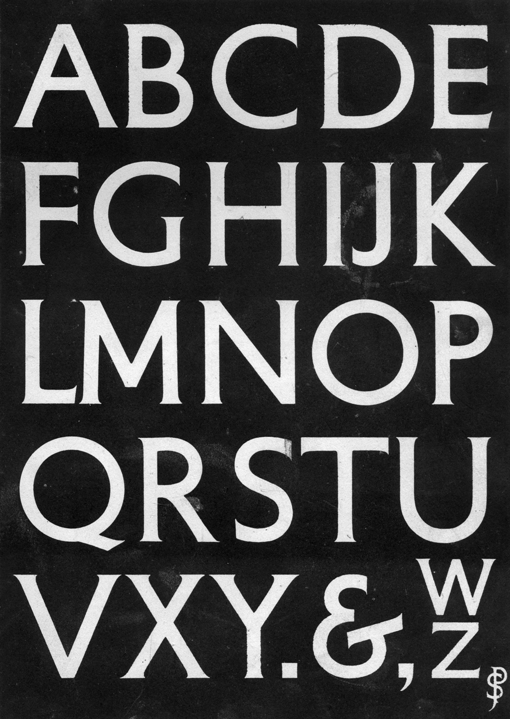
For the Petit Serif typeface, Matthieu Cortat was inspired by lettering created by Percy J. Delf Smith for the building located at 55 Broadway, s.W. 1, London, that he reproduced in his book, “Civic and Memorial Lettering*.
This typeface is a lineal of monumental roman capitals with classical proportions, that possesses very slight serifs due to the use of brushes in its creation. A character used for titles and shopfronts, it does not possess a lowercase, but is available in Greek and Cyrillic alphabets. The letters A and I have variants available for Basque.
Percy J. Delf smith R.D.I., Civic and Memorial Lettering, Adam & Charles Black, London, 1946.
Brett is a matrix font with rounded, overlapping bitmaps. With its elegant – if not a little vain – small capitals and its “old style” ligatures, it finds itself located somewhere between a “techno” style and a fanatical historicism.