TF, 2 letters that signify at the same time Type Foundry and Typographie Française (French Typography). 205TF is a type foundry that brings together the work of independent typeface designers, some of them well known, others closer to the beginning of their career, all highly talented. Each of them developing characters where a certain French spirit can be felt. 205TF is a foundry on a human scale, and beyond the distribution of their work, it supports typeface designers by making their creations available to a wider audience, allowing for greater recognition of their work.
205TF makes a choice of quality: a small number of creators, a precise selection of characters. The number is of little importance, the quality however is essential.
All of the characters are developed according to common standards (set standard, set pro and set spécial). The typefaces have – at a minimum – an extended set of characters (Latin extended) and this allows them to be used for compositions in a wide range of languages. With an Opentype format, they provide access to specific characters such as small capitals (according to the characters), different series of figures (aligned, old style, proportional and tabular), ligatures, fractions, etc.
This format allows access to specific typographic settings according to the characters. - For the group of characters – functions “All caps”, “Case sensitive punctuation”, “Tabular lining figures”, “Tabular old-style figures”, “Proportional old-style figures”, “Ligatures”, “Fractions”, “Ordinals”, “Contextual alternates”, “Localized forms”, etc.
For certain characters — “Small capitals”, “Capitals to Small Capitals”.
The presentation and interest of each function are detailed in the typeface specimens that can be downloaded for each typeface.
The groups of characters function with both MacOs and Windows platforms and have been tested for Office and Adobe applications. They can then be easily installed on the vast majority of computers and the direct transfer of a file that uses 205TF typefaces from one platform to another and from a Macintosh version of software to a Windows version of software is a process which is seamless.
For cases involving a specific and/or proprietary operating system or specific software, please contact us directly.
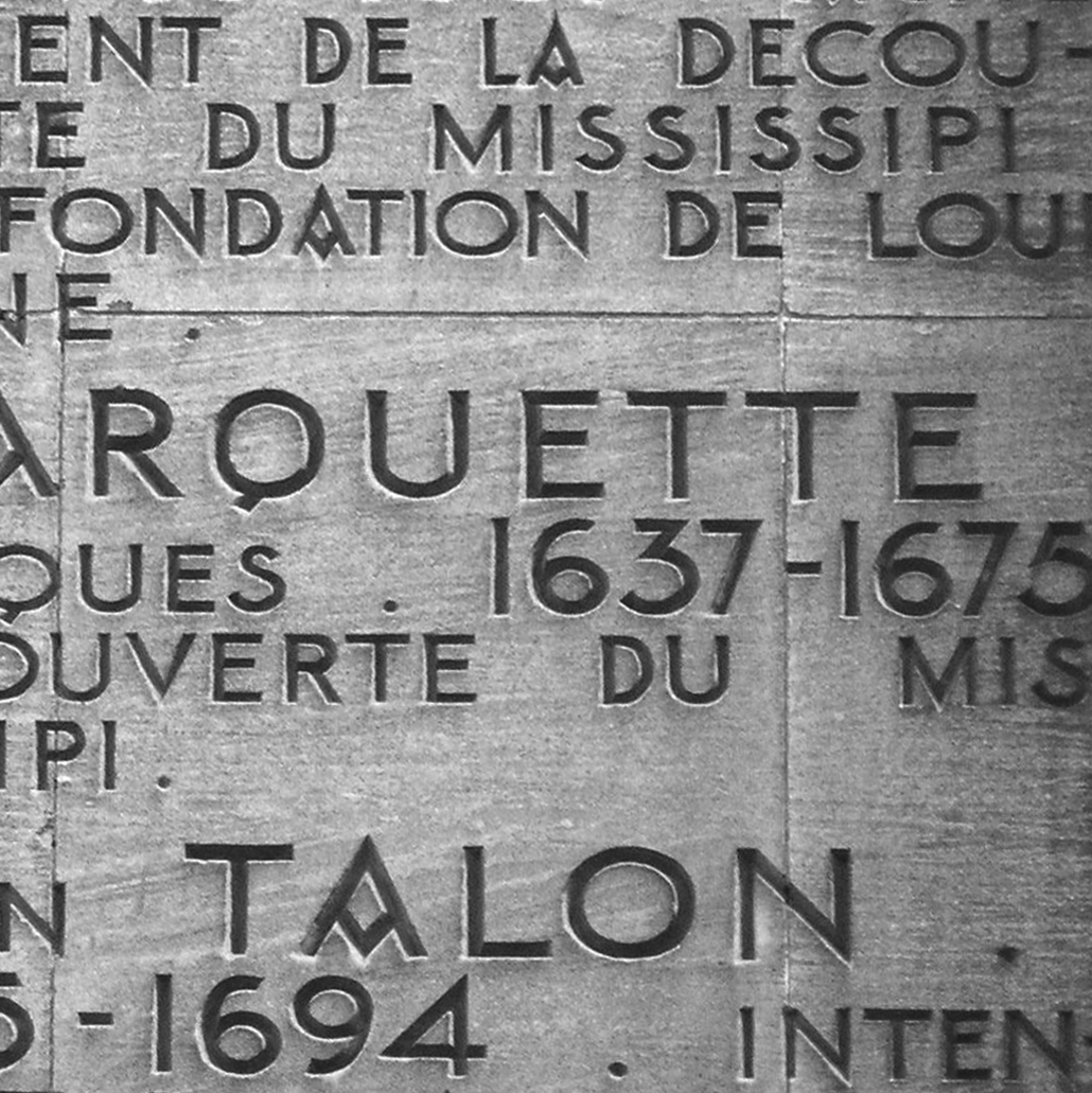
The Chrysaora typeface was originally commissioned by the architects of group8 and the artist John Armleder, for a piece entitled, “Les Plates-formes de la porte dorée”, inspired by the story of the Golden door. It is part of the Parisian landscape, echoing the engravings made by the great names of the wall of the Cité nationale de l'histoire de l'immigration, originally the Museum of the Colonies, a showroom for French colonialism. Chrysaora revisits the general features of these engravings, solely in capitals, and is used to engrave texts presented in John Armleder's work. Chrysaor (literally “golden sword”) was the son of Poseidon and Medusa, the brother of Pegasus. His mother was transformed into a gorgon by the goddess Athena as punishment for having desecrated her temple. A statue of Athena, incarnating a triumphant France, decorates the Palais de la Porte dorée.
The Chrysaora typeface is available in three weights, and can be used to compose more than 105 languages, including Vietnamese with its many accented characters. It also contains numerous ligatures.
Automatic Fractions
Superiors/Inferiors
Ordinals
Arrows
This standard corresponds to a set of characters that respond to the Extended Latin standard. It allows for the composition of a large majority of Western European languages. To do this, signs have been added to the standard latin alphabet, either through use of diacritic signs, or through construction of specific signs. The Extended Latin standard does not contain specific Cyrillic or Greek characters. The detail of the characters available for each typeface is presented in the typeface specimen that you can download from our website.
The list of languages in which it is possible to compose is in the specimen.