205 Corp.
24, rue Commandant-Faurax
69006 Lyon
France
T. 33 (0)4 37 47 85 69
M. contact@205.tf
Newsletter
How did you get involved with typeface design? What led you to this practise?
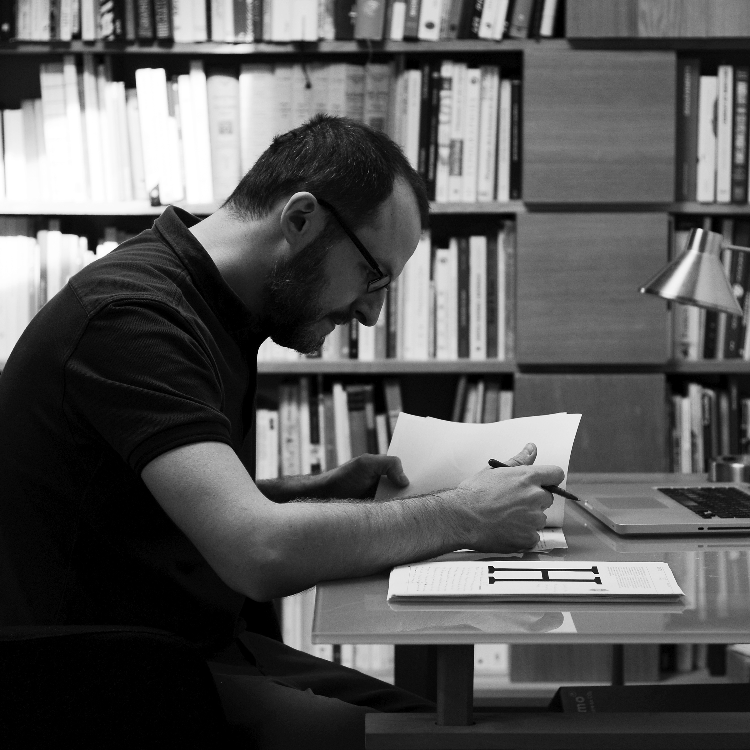
During my studies in Visual Communication at the Ecal in Lausanne, I was introduced to typeface design by François Rappo, as well as in workshops with Norm and Underware. It was there that I was lucky enough to meet Hans-Jurg Hunziker who convinced me to persevere along this path, and who spoke to me of the Atelier National de Recherche Typographique, in Nancy, where I pursued my education. Once my studies were finished, I moved to Lyon, carrying out both my work as a typeface designer and as a mediator, then scientific advisor in the Museum of Print and Graphic Communication (Musée de l’Imprimerie et de la Communication graphique) in Lyon.
Is there something specific about your approach to typeface design?
Thanks to my work in the Museum of Print and Graphic Communication, most of my typefaces are anchored in history. This doesn't make them revivals however, as I take a lot of liberties with regard to the models from which I begin my work. Let's say that I try, for each creation, to bring a contemporary feel to an atmosphere, a style drawn from the history of Typography. Sometimes it is a matter of revisiting a classic; other times of rediscovering a lost typeface; often it is a nod to a reference.
What influences you? Are there typeface designers whose work you appreciate in particular?
I don't really have any idols. I have a certain appetite for the British (Johnston, Gill and, slightly closer to home, Paul Barnes) and the French (Mandel, Mendoza, Jou) for questions of style. When it comes to questions of finishing and a certain rigour in development however, I am firmly on the side of the Swiss, Frutiger, Miedinger, the Optimo and Lineto foundries, for example. The American and Dutch typographers are somewhat a mystery to me. I would place myself nearer to typeface designers that are “sculptors” as opposed to “calligraphers”.
If you could only choose one typeface, which one would it be?
For what use exactly? Choosing a single typeface is like choosing a single food, a single garment. The choice of a typeface depends on the context. For a body text, let's say a book, I'd lean of course towards my last born, Helvetius, that will be soon available through 205tf.
In your opinion, what is the point of creating a new typeface when so many already exist?
Ask fashion designers why they launch collections every season? Or car manufacturers why they release new models every year? Or furniture creators? Architects? Musicians?
Is it really possible to create something new in the field of type design?
No. In the sense that, a letter must, at a moment or another, be even just slightly legible. The reader must then be in a position to recognise it. And to recognise it, it has to resemble something that already exists. So then, to create something completely new, one would have to create a new writing.
How do you begin work on a new typeface? Do you have a particular process?
No, not really. It could be a question of historical models, intentionally badly scanned so that I can leave a lot of room for interpretation. Or, in the case of a commissioned typeface, a sketch provided by a graphic designer. More often than not, I scribble a few far from perfect sketches to clarify what I am looking for, and then design directly on a computer.
What is your relationship with the history of typography? What is your relationship with technology?
I've already spoken about my relationship with history. I'm up to my neck in it. I know too much to just naively create fonts and imagine that they are revolutionary; and not enough to not get excited when I come across a specimen that I've never seen before.
Why have you chosen to distribute your characters and typefaces with 205TF?
Beyond the shared infrastructure that allows a greater functionality that would be complicated to put in place for an isolated designer, there is the choice of the catalogue: few typefaces, but well chosen, with high standards, designs, spacings and kernings all being verified by a number of people.
While the “great foundries” have catalogues that seem to go on forever, and look like supermarkets, 205TF is a gourmet food store: a more refined choice, and filled with quality.
Do you think that typography can save the world?
Let's not put that much weight on the shoulders of typography.
You teach at the ecal. Why does this role of transmission seem important to you?
What typeface designer doesn't want to see the general level of publications (on paper or screen) improved? And for that, people need to be trained, they need to have their minds opened and their vision educated. This requires time, patience and energy. Like all things that are worth doing.
What type design project are you currently working on?
I have never really been satisfied with the Gill and its different digital adaptations: too thin, too marked by their era; and, in general, by the humanistic lineals that are often too mannered. So I am working on a character in this style, with a very strong “bold” and sober italics.
Fonts
by Matthieu Cortat
Anacharsis
Basetica
Battling
Brett
Chrysaora
Cosimo
Helvetius
Henry
Louize
Louize Display
Louize Display Cond
Molitor
Muoto
Muoto Mono
Petit Serif
Stockmar
Stuart
Yorick
Zénith
Zénith Cyrillic