205 Corp.
24, rue Commandant-Faurax
69006 Lyon
France
T. 33 (0)4 37 47 85 69
M. contact@205.tf
Newsletter
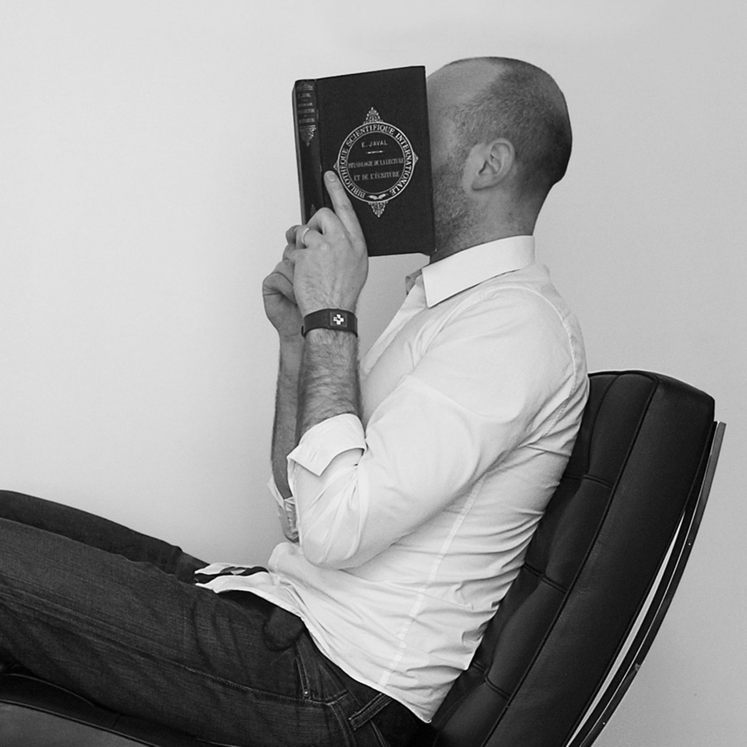
How did you get involved with typeface design? What led you to this practise?
I was a student at the School of Fine Arts of Besançon, where I discovered typography. I was self taught when it came to typeface design, using Fontographer, I threw myself into the design of Garaje, a typeface that I presented for my Fine Arts diploma. At that time it was a family of twenty or so fonts, that nourished my thinking around the geometrisation of the typographic sign, in vernacular inscriptions and in the European avant-gardes. Just after that I entered the ANRT, in 2001 – 2002, where I could dive fully into typeface design, by drawing and designing the lowercase M, a character for very small type sizes.
Is there something specific about your approach to typeface design?
A number of things are very important to me. To never move too far away from Graphic Design and to never lose sight of the way that typefaces are used: my activity as a designer provides me with a lot of pretexts to create characters, whether I am requested to do so or not. It is a way for me to appropriate the commission, and to add an element of typographic investigation to it.
As to the design itself, there are probably forms that we find from one character to another: nonetheless, I enjoy trying a new ways of designing for each character: not only another formal register, but testing another process. This is what stimulates me most.
What are your influences? The references and typeface designers whose work you particularly appreciate?
Graphic Designers have certainly marked me the most (like Experimental Jetset, Norm); when it comes to typeface designers, I admire the variety of drawings and designs of Carter or Frutiger, and the creations of Henrik Kuebel, for example.
If you had to choose only one typeface, which one would it be?
That's an extremely difficult question, and life would be incredibly sad with only one single typeface. If I had to give an answer I'd go with Akzidenz Grotesk Bold, old school.
In your opinion, what is the point of creating a new typeface when so many already exist?
Do we ask this question when speaking of painting or photography? There are indeed quite a few in existence, but I don't believe that any limit exists.
Is it really possible to create something new in the field of type design?
Of course, there are so many things to explore, everywhere: in history, technology, the writings of the world...
How do you begin work on a new typeface? Do you have a particular process?
I try to avoid following the same recipe each time, and adapt my methodology to the character that I intend to develop.
What is your relationship with the history of typography? What is your relationship with technology?
I am nourished, like most of us, by historical forms, but I try not to dive too deeply into them as it can very quickly have a paralysing effect. To quote Carter, I try to look at history for what it can nourish in the present and not for nostalgic reasons. As for technology, I am very interested in it: excellent tools are available to us today, and we have a relatively unprecedented capacity to adapt those tools to our needs. I am not a beast when it comes to development, far from it, but the whole field interests me greatly. Here too, as with history, we have to be careful not to confuse the means with the ends.
Why have you chosen to distribute your characters and typefaces with 205TF?
I have always worked independently, and even if I had been in possession of a foundry since 2007, the distribution of my characters has never been of interest to me, and I have no time to take care of it anyway. My friendship with the people behind the project, and the format that 205TF proposes suits me perfectly, I didn't hesitate for a second.
Do you think that typography can save the world?
Absolutely.
You teach at l'ANRT (Atelier national de recherche typographique, Nancy). Why does this role of transmission seem important to you?
I have always been a full time teacher, and I find it very important for my own equilibrium. I like interacting with students, working with my colleagues, organising things and doing research. These different activities (type design, Graphic Design, teaching) complement and nourish one another and I find this very stimulating.
What type design project are you currently working on?
A custom typeface for a huge hotel in Las Vegas that was commissioned by an agency. Class, American style! Its a glyphic serif; I've never designed one before and it's been very pleasant so far.
Fonts
by Thomas Huot-Marchand
Album Sans
Album Slab
Garaje Cond A
Garaje Cond B
Garaje Cond C
Garaje Cond D
Garaje Cond E
Garaje Cond Mono A
Garaje Cond Mono B
Garaje Cond Mono C
Garaje Cond Mono D
Garaje Cond Mono E
Garaje Mid
Garaje Multi
Garaje Total
Garaje Wide A
Garaje Wide B
Garaje Wide Mono A
Garaje Wide Mono B
Minérale
Minuscule