205 Corp.
24, rue Commandant-Faurax
69006 Lyon
France
T. 33 (0)4 37 47 85 69
M. contact@205.tf
Newsletter
How did you get involved with typeface design? What led you to this practice?
As a teenager, I did a lot of graffiti, drawing in my notebook and spray-painting letters on walls. During this self-taught phase, I developed a strong appreciation for Hassan Massoudy’s calligraphy. Later on, I enrolled in the École supérieure d’art of Cambrai, followed by the École supérieure d’art et design of Valence, where I gradually discovered typography, primarily in terms of its practical application rather than its design. I immediately took a liking to it, although it took me quite some time to grasp the intricate issues and subtleties of this discipline.
When I started working, I created some drafts of typefaces, but my primary association with typography is through editorial design and my role as a graphic designer. Lately, I have been increasingly enjoying coming up with different typefaces. I strive to fully develop this process by proposing a cohesive, stable, and functional version of an alphabet.
What influences you? Are there type designers whose work you appreciate in particular?
While I was a student, I interned with Philippe Apeloig, whose type design work I greatly appreciate. He was strongly influenced by Dutch graphic design from the 1960s and 1970s after his encounter with Total Design. I truly admire the work of Wim Crouwel and Jurriaan Schrofer. In a similar vein, but more recently, the graphic design work of Karel Martens is a great source of inspiration for me (particularly the superb poster he created for the Chaumont Festival in 2010). I also value Pierre di Sciullo’s work, especially the connection he establishes between his typography and language. Closer to my own generation, I’m also very interested in the work of Benoît Bodhuin; his bold formal proposals challenge a certain tradition of modular typefaces.
In your opinion, what is the point of creating a new typeface when so many already exist?
The meanings of the words we use are constantly evolving, both over time and across different regions. Language is influenced by its surroundings, our societies, and their ongoing developments. So it appears entirely natural to me that the visual forms used to represent the words should adapt and reflect these shifts and transformations.
What’s more, from a purely formal perspective, it presents a fascinating challenge and a delightful playground for designers to envision new forms for these letters that have been in use for centuries.
Is it really possible to create something new in the field of type design?
This question can be extended to numerous other domains. I firmly believe that it is quite feasible to generate something innovative, and this will inevitably remain true. Each era introduces its unique innovations, possibilities, disruptions, and surprises. While more or less conscious influences certainly play a role in the creative process, each individual contributes their own distinct vision. Perhaps, in each different era, we formulate hypotheses to synthesize existing forms.
How do you begin work on a new typeface? Do you have a particular process?
I didn’t receive any formal training in type design as a student. I started with modular typography as I found it more approachable and enjoyable. Currently, I don’t just design; I construct. I assemble different forms, adding and subtracting elements to explore formal possibilities. Afterward, comes the design stage where I refine and adapt the form, making it more flexible or transforming it as necessary. If I find that I lack technical expertise in type design for certain projects, I like to explore alternative paths or unconventional approaches. This always leads to interesting outcomes.
What is your relationship with the history of typography? What is your relationship with technology?
The field of type design has fascinated me ever since I first discovered it. I gather information from magazines, books, exhibitions, and, of course, online sources for typographic news. I don’t want to limit myself too much to this narrative, as I enjoy drawing connections between historical creations and more contemporary works. I have also developed a penchant for blending different artistic disciplines. A few years ago, I discovered contemporary dance, and it currently has a significant influence on my work.
I believe I have a paradoxical relationship with technology. On one hand, I am captivated by its capabilities and the vast formal possibilities it offers. On the other hand, I approach it cautiously because this fascination often leads me away from the essence of a project and the intended meaning I want to convey. For instance, I find variable font technology absolutely intriguing, and I would love to use it for generating new projects. However, I have also recently established the Association Presse Offset, which takes a craft-oriented approach to printing using a 1980s offset press…
Why have you chosen to distribute your typefaces with 205TF?
I have a keen interest in the progress of type design and type foundries. When it comes to 205TF, I am impressed by the high quality of the typefaces they offer, and I frequently use them in my own graphic projects. I am also struck by the foundry’s openness, especially in embracing adventurous and unconventional forms. So, I take great pride in seeing Bertin added to the 205TF catalogue!
Do you think that typography can save the world?
Engaging in production or work outside of the dominant market system can be seen as a form of resistance. So, yes, in certain cases, artistic creation and graphic design have the potential to contribute to making the world a better place. Like so many other things…
Do you teach? If so, where, and why does this role of transmission seem important to you?
I have been teaching at the École européenne supérieure d’art of Bretagne (EESAB) for several years, and I find it incredibly rewarding. I have a genuine affinity for the art school environment. On one hand, it continues to provide a space where freedom of expression and critical thinking can be nurtured. On the other hand, it allows me to stay connected to emerging creations and societal issues through close interactions with students and fellow teachers. In France, many of the well-known schools are public institutions, making them relatively affordable compared to some neighboring countries. I am delighted to be part of a system that promotes easier access to art and design.
What type design project are you currently working on?
As part of a public commission, I am currently working on the development of a type family inspired by the ground plan of a high school. I approach this project as a playful artistic creation, although I do take into account certain design considerations during its development. The typeface is currently divided into two families: a modularly constructed titling version and a running text version that flows from the former. Each family encompasses various styles and style sets, exploring the potential of variable fonts. The typeface will be freely available for non-commercial use.
Fonts
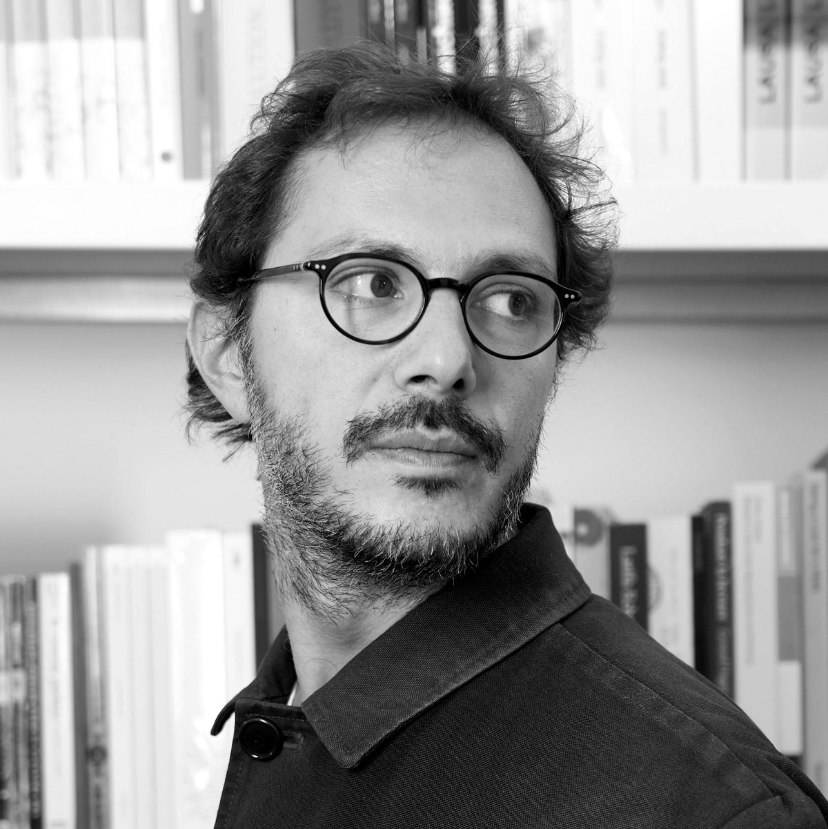
by Roman Seban