205 Corp.
24, rue Commandant-Faurax
69006 Lyon
France
T. 33 (0)4 37 47 85 69
M. contact@205.tf
Newsletter
How did you get involved with typeface design? What led you to this practice?
I have been interested in calligraphy for a very long time, and practice it as an amateur. I began studying graphic design in Nantes where I had the opportunity to see the exhibition by the Type Directors Club and to attend the conferences that accompanied the event. I found Jean-François Porchez’s conference particularly striking as, at the time, I wasn’t really aware how important typography and the profession of type designer was. You could call it love at first sight really. In my final year, I did an internship with Typofonderie and my degree project was the creation of the Andersen typeface. This allowed me to combine my interest for typography, and my relationship with reading and teaching that I had experimented with as a primary school teacher. The project was quite well received, and led to me studying in the post graduate program, “Typographie et langage” at the ESAD in Amiens. I developed the Latin/Arabic typeface, Batutah.
Following that I worked as a freelance designer for a while and then in Lille with Ateliers 59, a studio that specializes in visual identity and signage. Currently, I live in Nantes where I work with the Collectif Sans Sherif as a freelance type designer and teacher.
What influences you? Are there typeface designers whose work you appreciate in particular?
Many things inspire me. I follow the work of contemporary graphic designers like Kris Sowersby, Underware, Nikola Djurek, Kristyan Sarkis... I’m also have a strong interest for historical sources: specimens, posters, magazines… I’m interested in vernacular lettering, which I also collect. I always try to have one foot in the past and the other in the present.
In your opinion, what is the point of creating a new typeface when so many already exist?
This questions comes up regularly with the people that I bump into who don’t work in the creative fields. I often answer with a different question: “Why create new clothes, new cars, new music?” For the same reasons: because people’s tastes evolve over time, according to geographical locations and trends. Software and Opentype code allow us to do things that were previously impossible, such as the principle of interpolation. New needs also arise and new uses appear. There is also the development of systems of writing other than Latin, such as Cyrillic, Arabic and Hebrew and Devanagari which all possess great potential.
Is it really possible to create something new in the field of typeface design?
If that wasn’t the case I wouldn’t be involved in this profession! Yes, it is possible to create new typographic forms. Indeed this is where the interest of the profession lies: managing to create new forms while at the same time taking into account a certain tradition, proportions, reading habits and the presence of typefaces which already possess striking and innovative qualities.
How do you begin work on a new typeface? Do you have a particular process?
When I start designing a new typeface – whether it be a “retail” project, or even a “custom” one – I set out a brief containing the project expectations at the very start: number of thicknesses or weights, set of characters, functions, uses, styles, universes, references… The more detailed this brief is, the easier it is for me to know where I’m headed. This is followed by a phase of research with drawing and then, quite quickly, I begin using software to design a couple of glyphs. In my case I use the word “vaphosie” which doesn’t mean anything but which is useful as it provides the key characteristics which will help me to develop the rest of the alphabet. I do a number of tests, advancing in steps, and once I feel that the design is stable I develop the whole typeface.
What is your relationship with the history of typography? What is your relationship with technology?
Whether we like it or not, typography originates in a context, in a specific period and this is also the case with very contemporary typefaces. For me, the history of typography is important as it allows us to understand the origin of the forms, and it is also a huge source of inspiration. It is also difficult to avoid technology that allows one to work in a more rapid and efficient way. The technological aspect of our professions develops quickly. This is one aspect of the profession which stimulates me.
Why have you chosen to distribute your characters and typefaces with 205TF?
I have followed the evolution of 205TF since its creation and was already well aware of the work of Bureau 205 and their strong interest for typography. I was already convinced of the high quality and serious nature of the project. My first typeface, Lewis is distributed on Myfonts who are simply distributors. I was looking for a structure which chose quality typefaces and which worked closely with creators. 205TF is a great fit.
Do you think that typography can save the world?
Absolutely! As a wise man once said: no typography, no salvation! On a more serious note, while it may not save the world, typography can, at its level, attempt to improve things a little. For example, the Balkan Sans typeface is composed on two levels, an upper one and a lower one, simultaneously presenting Latin and Cyrillic letters in an attempt to reconcile a Serbian population that has diverse influences running through it. Eco-font consumes less ink thanks to the empty areas inside the lines of the letters. The Homeless project fonts propose typefaces that are inspired by writing done by homeless people, and the proceeds from the sale of this typeface go to an association which works with homeless people. Beyond these projects, the development of typefaces or systems of writing that are in the danger of disappearing seems of primary importance to me as this helps the survival and transmission of languages.
Do you teach? If so, where, and why does this role of transmission seem important to you?
I work in the ECV Nantes and at E-Art Sup Nantes. In addition to that, I animate workshops and conferences. This role of transmission seems important to me as typography is a discipline that students – and thus future professionals – will be faced with on a daily basis whether it be for print of digital media. I try to pass on to students not only my know-how in relation to typeface design but also my knowledge of other subjects like the Opentype functions or how user licenses for typefaces function for example.
What type design project are you currently working on?
I’m currently working on a number of projects: the development of the Latin/Arabic typeface Batutah that I created when I was a student, the development of a lineal in a number of thicknesses for the Latin and the Cyrillic and finally a commission for a festival: a titling typeface inspired by the Art Deco movement.
Fonts
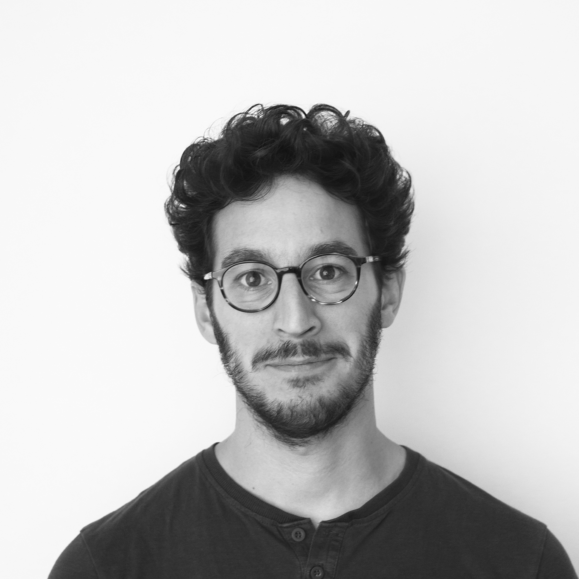
by Thierry Fétiveau