TF, 2 letters that signify at the same time Type Foundry and Typographie Française (French Typography). 205TF is a type foundry that brings together the work of independent typeface designers, some of them well known, others closer to the beginning of their career, all highly talented. Each of them developing characters where a certain French spirit can be felt. 205TF is a foundry on a human scale, and beyond the distribution of their work, it supports typeface designers by making their creations available to a wider audience, allowing for greater recognition of their work.
205TF makes a choice of quality: a small number of creators, a precise selection of characters. The number is of little importance, the quality however is essential.
All of the characters are developed according to common standards (set standard, set pro and set spécial). The typefaces have – at a minimum – an extended set of characters (Latin extended) and this allows them to be used for compositions in a wide range of languages. With an Opentype format, they provide access to specific characters such as small capitals (according to the characters), different series of figures (aligned, old style, proportional and tabular), ligatures, fractions, etc.
This format allows access to specific typographic settings according to the characters. - For the group of characters – functions “All caps”, “Case sensitive punctuation”, “Tabular lining figures”, “Tabular old-style figures”, “Proportional old-style figures”, “Ligatures”, “Fractions”, “Ordinals”, “Contextual alternates”, “Localized forms”, etc.
For certain characters — “Small capitals”, “Capitals to Small Capitals”.
The presentation and interest of each function are detailed in the typeface specimens that can be downloaded for each typeface.
The groups of characters function with both MacOs and Windows platforms and have been tested for Office and Adobe applications. They can then be easily installed on the vast majority of computers and the direct transfer of a file that uses 205TF typefaces from one platform to another and from a Macintosh version of software to a Windows version of software is a process which is seamless.
For cases involving a specific and/or proprietary operating system or specific software, please contact us directly.
Team
Rémi Forte, Foundry Manager
As Foundry Manager, Rémi Forte supports 205TF’s type designers in the development of their projects. He is also in charge of the foundry’s communication and customer relations.
Alongside his work for 205TF, Rémi is developing a practice-based research thesis in the TransCrit Research Unit (University of Paris 8), which follows his studies at the École nationale supérieure des beaux-arts (ENSBA) in Lyon, and Atelier national de recherche typographique (ANRT) in Nancy.
He also teaches graphic design and typography.
Damien Gautier, Founder and Partner
Cofounder of 205TF in 2017, Damien Gautier is codirecting the foundry’s operations and contributing to the catalogue as a type designer. His typefaces are available exclusively at 205TF, such as Maax, Plaak, Plaax, Alcalá or Beretta.
Florence Roller, Founder and Partner
Cofounder of 205TF in 2017, Florence Roller is codirecting the foundry’s operations. She leads with Damien Gautier the graphic design studio Bureau 205 and the publishing house Éditions deux-cent-cinq. Coauthor of 3 manuals on visual identity, posters and typography, she holds a degree from the École supérieure des Arts du Rhin in Strasbourg (HEAR).
New releases are carefully selected every year by the team and its advisory board, comprised of Matthieu Cortat, Thomas Huot-Marchand and Alice Savoie. They stand for a level of quality that our customers deserve and look for.
Matthieu Cortat is a type designer. He has designed several custom typefaces for clients, such as Eastpak, Caran d’Ache, the City of Lausanne, the Terminal Four at JFK Airport in New York or the TV channel Eurosport. He is Head of Master Type Design at the University of Art and Design Lausanne (ECAL). His typefaces are exclusively available at 205TF, including the most recent ones Zénith, Cosimo, Helvetius, Yorick or Molitor.
Thomas Huot-Marchand divides his time between teaching, type design and graphic design. Since 2012, he is Director of the Atelier national de recherche typographique (ANRT) in Nancy. A former resident of the Académie de France in Rome – Villa Médicis in 2006–2007, then at the Hoffmitz Milken Center for Typography of Pasadena from May to July of 2019, he is now living and working in Besançon, where his activity as a Graphic Designer has developed mainly in the cultural sector. He has been a member of the Alliance Graphique Internationale (AGI) since 2010. The typefaces of Thomas Huot-Marchand are exclusively available at 205TF, such as Album, Garaje, Minérale or Minuscule.
Alice Savoie is an independent type designer and researcher. She holds an MA and a PhD from the University of Reading. As a practicing type designer she has collaborated with international foundries and design studios. Her recent type design works include Faune, an award-winning typeface family for the French Centre national des arts plastiques. She teaches at ANRT in Nancy (France) and ECAL in Lausanne (Switzerland). 205TF distributes her typeface Romain 20.
Charly Derouault, Alexis Faudot and Federico Parra regularly collaborate with the foundry as graphic and type designers.
Roxane Gataud did work with 205TF from 2016 to 2020 as a type designer and font engineer.
Thomas Leblond, a graphic designer, participated in the creation of the foundry in 2017.
We look forward to possible font proposals. Please do not hesitate to contact us for sharing your projects.
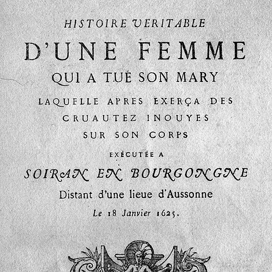
In 1846, Lyonnais printer, Louis Perrin commissioned founder Francisque Rey to engrave a series of capitals inspired by monumental roman inscriptions. They would go on to be used in the composition of work on the Antique inscriptions of Lyon, by Alphonse de Boissieu. In 1855, the typeface was completed by a number of lowercase fonts; certain bodies came from the stocks of Rey, others were drawn by Perrin himself. His “Augustaux”, one of the first “revivals” in the history of typography, became rapidly successful, launching the “Renouveau Elzévirien” (Old-style Renewal) movement. With Louize, Matthieu Cortat provides a contemporary reinterpretation of the Augustaux. It retains a wise and serene tone, the grey of clear text, the soft roundness of the curves. Louize is discreet, calm, harmonious.
Available in three weights, Louize has a number of small capitals (for the roman styles) and ornamental capitals (for the italics).
Caps Punctuation
Small Caps Punctuation
Proportional Lining Figures
Proportional Old Style Figures
Tabular Lining Figures
Tabular Old Style Figures
Roman Numerals
Automatic Fractions
Superiors/Inferiors
Ordinals
Discretionary Ligatures
Smash Capitals (Italic only)
Arrows
This standard corresponds to the standard set to which is added a significant quantity of signs decided by the designer as a function of the typeface itself: small capitals, series of complete inferior and superior letters and numbers, titling capitals, etc. The detail of the characters available for each typeface is presented in the typeface specimen that you can download from our website.