205 Corp.
24, rue Commandant-Faurax
69006 Lyon
France
T. 33 (0)4 37 47 85 69
M. contact@205.tf
Newsletter
How did you get involved with typeface design? What led you to this practice?
In 2011 I was preparing my degree in graphic design in the école des arts décoratifs de Strasbourg (which has since become the Haute école d’art du Rhin). I had developed a passion for the mechanics of reading thanks to research done by Stanislas Dehaene. Discovering the developments and transformations of our system of reading and writing led me to design a first typeface for use in film subtitles. At the time I was totally self taught. By a stroke of luck, Barbara Dennys was president of the panel who judged my degree. This led to my participation in the “Typographie & Langage” post-graduate program at the Ésad in Amiens where I was delighted to learn how to design typefaces. Ganeau, a family of latins designed in various optical sizes, is the result of that month of learning. I have been working as a freelance graphic and type designer, two disciplines which are closely connected in my practice, since 2013. My strong interest for systems of writing took shape while I was working on Infini, a free to use typeface family which I designed for the Cnap in 2014.
What influences you? Are there typeface designers whose work you appreciate in particular?
During my time as a post-graduate student I was attracted to the generous typographic forms of Roger Excoffon, José Mendoza y Almeida and Ladislas Mandel (my teacher, Sébastien Morlighem played a vital role in my discovery of these three designers). At the same time, I am fascinated by very straightforward, very terse designs, similar to the typefaces of Rudolf Koch, or Berthold Wolpe with his Albertus or even Louis Oppenheim with Fanfare, and of course Vendôme by François Ganeau.
In your opinion, what is the point of creating a new typeface when so many already exist?
When responding to a graphic design commission, I do my best to design a typeface which is made to measure, whether it be for a visual identity, for signage or a logotype… Typeface design is a means which allows one to accurately respond to the needs of the commission. They are tools that I design and the notion of “made to measure” is very important to me. I try to be as precise as possible and typefaces contribute to this. Each project is specific in nature and may require its own character.
Is it really possible to create something new in the field of typeface design?
This is one of the main motivating factors in type design, how to juggle the existing with the new. Clearly we are not starting from scratch. Forms which influence matters of legibility exist, each medium and use come with their own set of restrictions. To this can be added our stylistic references. I try not to look too much at my preferred typefaces out of a fear that I might try to redesign them, I keep my distance from them so as to avoid copying them.
What I love more than anything else about typeface design is the question of nuances. Tiny modifications can totally transform a text and the possibilities are endless!
How do you begin work on a new typeface? Do you have a particular process?
When beginning too design a typeface, I pay close attention to the commission while analyzing its context. Then I seek to formalize all of this through new forms – those most adapted to each project – rather than beginning with an existing typeface. The first steps are always drawn by hand and then quickly digitized. I like taking my time when doing research and testing, but sometimes a sense of urgency does give rise to interesting surprises.
What is your relationship with the history of typography? What is your relationship with technology?
A knowledge of the history of typography seems essential to me for both understanding the typefaces which surround us and for creating new ones. History is a source of inspiration and provides a base which allows me to create a framework. It also allows me to play with appropriate references. I am currently questioning type classification by developing a typeface intended to be unclassifiable, which will at the very least represent the intersection of a number of references.
Technology has developed greatly in recent decades. We are lucky because it allows us to be both efficient and productive. I try to consider it as being helpful, and it is indeed precious, while at the same time keeping it at arm’s length in order to avoid it structuring my projects. It is, first and foremost, a tool in the service of design.
Why have you chosen to distribute your characters and typefaces with 205TF?
From my time as a student, I have followed and admired the designs produced by Bureau 205. In their capacity as graphic designers they have a healthy awareness of the needs and desires of their fellow graphic designers. By opening the 205TF type foundry, they are daring to propose a catalog which is quite unlike anything found in the more traditional models. Various different kinds of typefaces can find a home. Injurial for example, a display typeface composed solely of capitals.
Do you think that typography can save the world?
Typography is a tool for communication that can help people to gain a better understanding of the world. A sufficiently admirable vocation for its frail shoulders.
Do you teach? If so, where, and why does this role of transmission seem important to you?
I have been teaching, regularly or occasionally, in various different schools at different levels for around five years now. I also run workshops for children and provide training for graphic designers. Thanks to these different activities I can share and transmit my passion for typography and type design, and also introduce people to the major issues in the field today. I am constantly concerned with questions of transmission and discovery. I do my best not to approach things in a traditional way, and often I use play in my work. If one does not take pleasure in one is doing, one cannot learn.
What type design project are you currently working on?
I am currently designing a type family for the université de Sciences-Po Saint-Germain-en-Laye. They have also asked me to design their visual identity.
Fonts
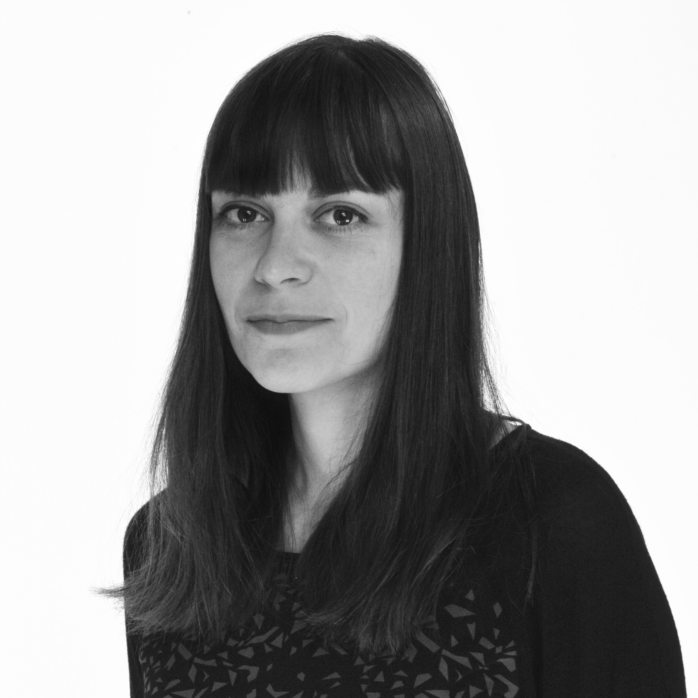
by Sandrine Nugue